Table of Contents
Pre-amble
This post illustrates the use of R to track the incidence of COVID-19 in relevant countries, and applies various analyses to those data in an attempt to gauge the success of public health containment efforts in reducing the speed and degree of spread.
It is a continuation of a earlier post containing a more detailed analysis of COVID-19 data for China, which was created as a teaching tool for post-graduate health data science students to introduce them to tools and methods that can be used to track and analyse the spread of COVID-19, both in Australia and elsewhere.
The analyses presented here have not been subject to peer-review, and they should not be relied upon for to inform governmental or health care policy.
Please also note that this post only uses data up to the date of publication (1st March 2020), and thus it cannot be considered a situation report reflecting the latest available data.
The full code is available from the GitHub repository linked at the foot of this post.
Data sources
Obtaining detailed, accurate, current data for the COVID-19 epidemic is not as straightforward as it might seem. Various national and provincial/governmental web sites in affected countries provide detailed summary data on incident cases, recovered cases and deaths due to the virus, but these data tend to be in the form of counts embedded in (usually non-English) text.
There are several potential sources of data which has been abstracted and collated from such governmental sites. One convenient set of sources comprises relevant wikipedia pages, such as this one for China. There are equivalent pages for Japan, South Korea, Iran and Italy (and other countries). Use of these pages through web scraping can be challenging, however, because the format of the tables in which the data appears changes many times per day.
Another widely-used source is a dataset which is being collated by Johns Hopkins University Center for Systems Science and Engineering (JHU CCSE) and which is used as the source for this dashboard.
In this document we will nevertheless scrape data from the relevant wikipedia pages, because it tends to be more detailed and better referenced than the equivalent JHU data, and in order to illustrate the joys and the endless despair of web-scraping.
Data limitations
The biggest problem with these analyses is that they are not based on data tabulated by date of onset (of symptoms), but rather on data tabulated by date of reporting, or perhaps date of confirmation by lab test. If lab testing and reporting is swift and the lag is uniform, then the date of reporting or confirmation will lag consistently and only slightly behind the date of onset. But reality is rarely so nice, and typically there are variable delays in lab confirmation and/or reporting, leading to backlogs of cases being reported all at once (known as a “data dump” by outbreak epidemiologists). This is very unfortunate, and it frustrates efforts to properly assess outbreak trajectories and effectiveness of intervention strategies. The solution is for authorities to provide line-listings of all cases, including their date of reporting and their date of onset of symptoms, even if only presumptive dates are provided (and missing dates of onset can be imputed, in any case). No details that permit identification of cases or invasion of their privacy need be provided in such line listings.
The effect of the unavoidable (because that’s all that is available) use of data tabulated by date of reporting here (and just about everywhere else) means that reproduction numbers and related measures of infectiousness may be inflated, particularly at first. Nonetheless, the methods illustrated here and in part 1 illustrate the potential utility of epidemic trajectory analysis – but that utility would be so much greater if health authorities published data tabulated by date of onset, or better, line-listings that include date of onset. It would be very easy for them to do that.
The lack of empirical serial interval data is also a problem, discussed further below and in the earlier analysis.
Analysis methods
At the time of writing, it seems that a global pandemic of COVID-19 is inevitable, if not already under way. However, a critical issue is whether local transmission can be slowed, ideally to the point where transmission is no longer self-sustaining, and failing that, at least enough to allow hospitals and other medical care facilities to keep up with the flood of patients – in other words, can local transmission effectively be damped-down enough to allow health care services to cope?
The section on China below shows that local transmission, even on the very large scale that occurred in Hubei province, can indeed be slowed and eventually extinguished by swift and decisive public health action. In the case of mainland China, the action taken by Chinese authorities after the seriousness of the Wuhan outbreak was fully recognised in early January 2020 was massive and completely unprecedented. And it worked! The world owes a debt of gratitude to the people of Wuhan and other cities in Hubei province for the hardships and deprivations they have endured in order to dramatically slow the spread of COVID-19 across China and thence rest of the globe. 谢谢
Can that success be repeated elsewhere?
To throw some light on that question, the analysis presented here primarily uses R packages developed and published by the R Epidemics Consortium (RECON). Details of their use can be gleaned from examination of the code, available via the GitHub link at the foot of this post.
The functions provided by the RECON incidence package are used to fit log-linear models to the growth and decay phases of the outbreak in Hubei, and the decay phase model is used to very approximately predict when local transmission will be extinguished there.
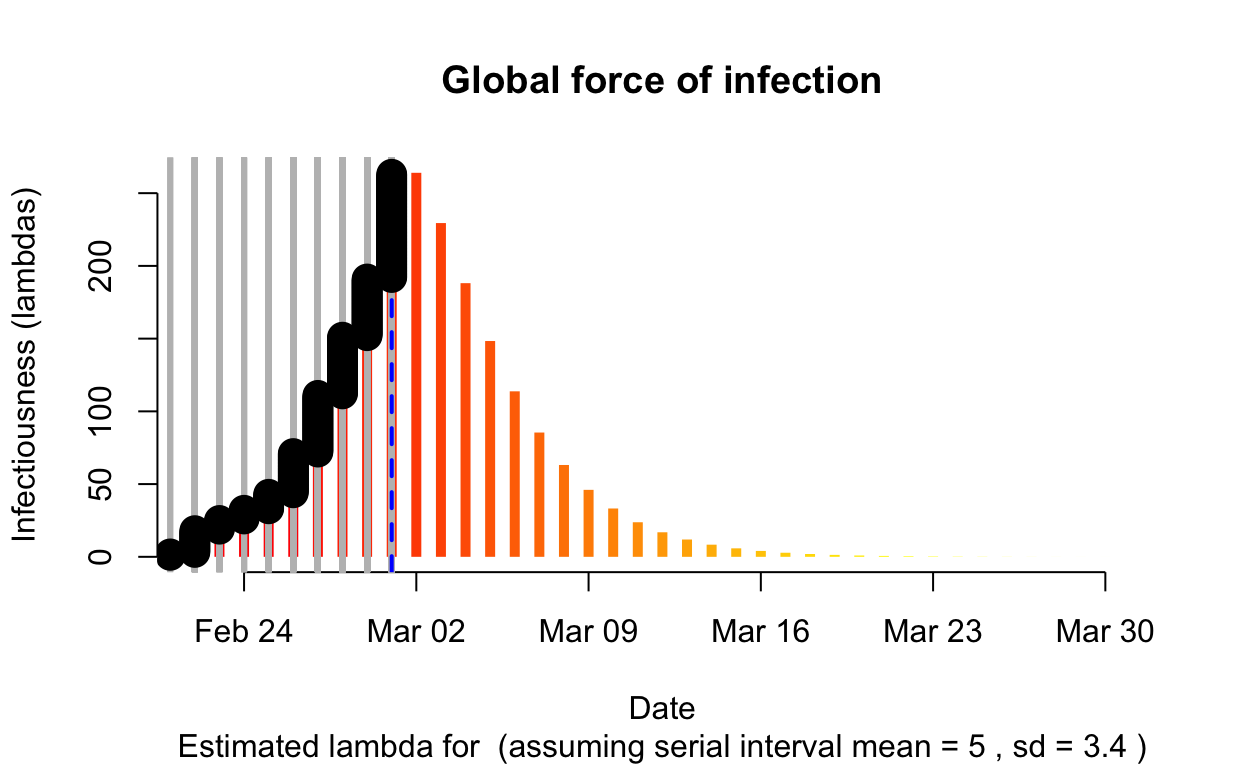
The sections on Japan, South Korea, Italy and Iran use the earlyR and EpiEstim packages, also published by RECON. In particular the get_R() function in earlyR calculates a maximum-likelihood estimate (from a distribution of likelihoods for the reproduction number) as well as calculating \(\lambda\), which is a relative measure of the current “force of infection”:
\[ \lambda = \sum_{s=1}^{t-1} {y_{s} w (t - s)} \]
where \(w()\) is the probability mass function (PMF) of the serial interval, and \(y_s\) is the incidence at time \(s\).
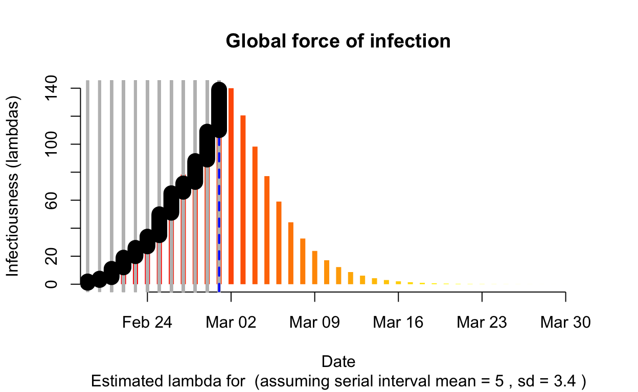
The resulting \(\lambda\) “force of infection” plot indicates the daily effective infectiousness (subject to public health controls), with a projection of the diminution of the force of infection if no further cases are observed. The last date of observed data is indicated by the vertical blue dashed line. New cases are shown in a cumulative manner as black dots. It is a sign that the outbreak is being brought under control if \(\lambda\), as indicated by the orange bars, is falling prior to or at the date of last observation (as indicated by the vertical blue line). Note that left of the vertical blue line the \(\lambda\) values are projections, valid only in no further cases are observed. As such, the plot is a bit confusing, but it is nonetheless useful if interpreted with this explanation in mind. The RECON packages are all open-source, and easier-to-interpret plots of \(\lambda\) could readily be constructed.
The critical parameter for these calculation is the distribution of serial intervals (SI), which is the time between the date of onset of symptoms for a case and the dates of onsets for any secondary cases that case gives rise to. Typically a discrete \(\gamma\) distribution for these serial intervals is assumed, parameterised by a mean and standard deviation, although more complex distributions are probably more realistic. See the previous post for more detailed discussion of the serial interval, and the paramount importance of line-listing data from which it can be empirically estimated.
In this post, we will incorporate this uncertainty around the serial interval distribution by specifying a distribution of SI distributions for the estimation of the instantaneous effective reproduction number \(R_{e}\). We’ll retain the mean SI estimated by Li et al. of 7.5 days, with an SD of 3.4, but let’s also allow that mean SI to vary between 2.3 and 8.4 using a truncated normal distribution with an SD of 2.0. We’ll also allow the SD of the SD to vary between 0.5 and 4.0.
For the estimation of the force of infection \(\lambda\), for the serial interval we’ll use a discrete \(\gamma\) distribution with a mean of 5.0 days and a standard deviation of 3.4.
China
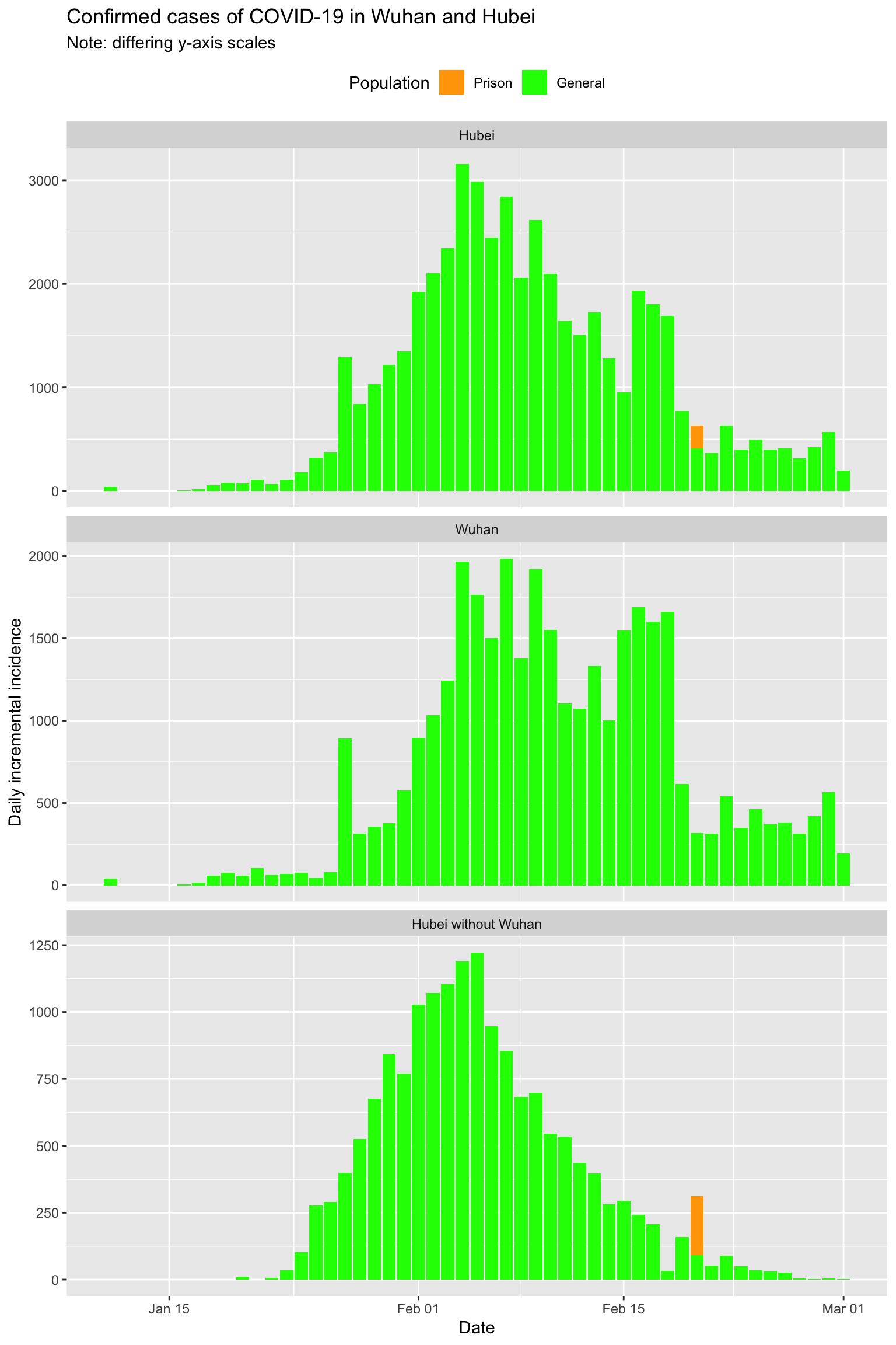
Epidemic curves for each Chinese mainland province
Let’s visualise the epidemic (daily incremental incidence) curves for all the mainland Chinese provinces.
Note that China began to include incidence data for prison populations starting 20th February. There are clusters in several prisons, specifically 220 cases in Wuhan Women’s Prison and Shayang Hanjin Prison in Hubei (but actually outside of Wuhan city), 200 cases in Rencheng Prison in Shandong province, and 27 cases in Shilifeng Prison in Zhejiang province. These cases are shown separately in this set of epidemic curves:
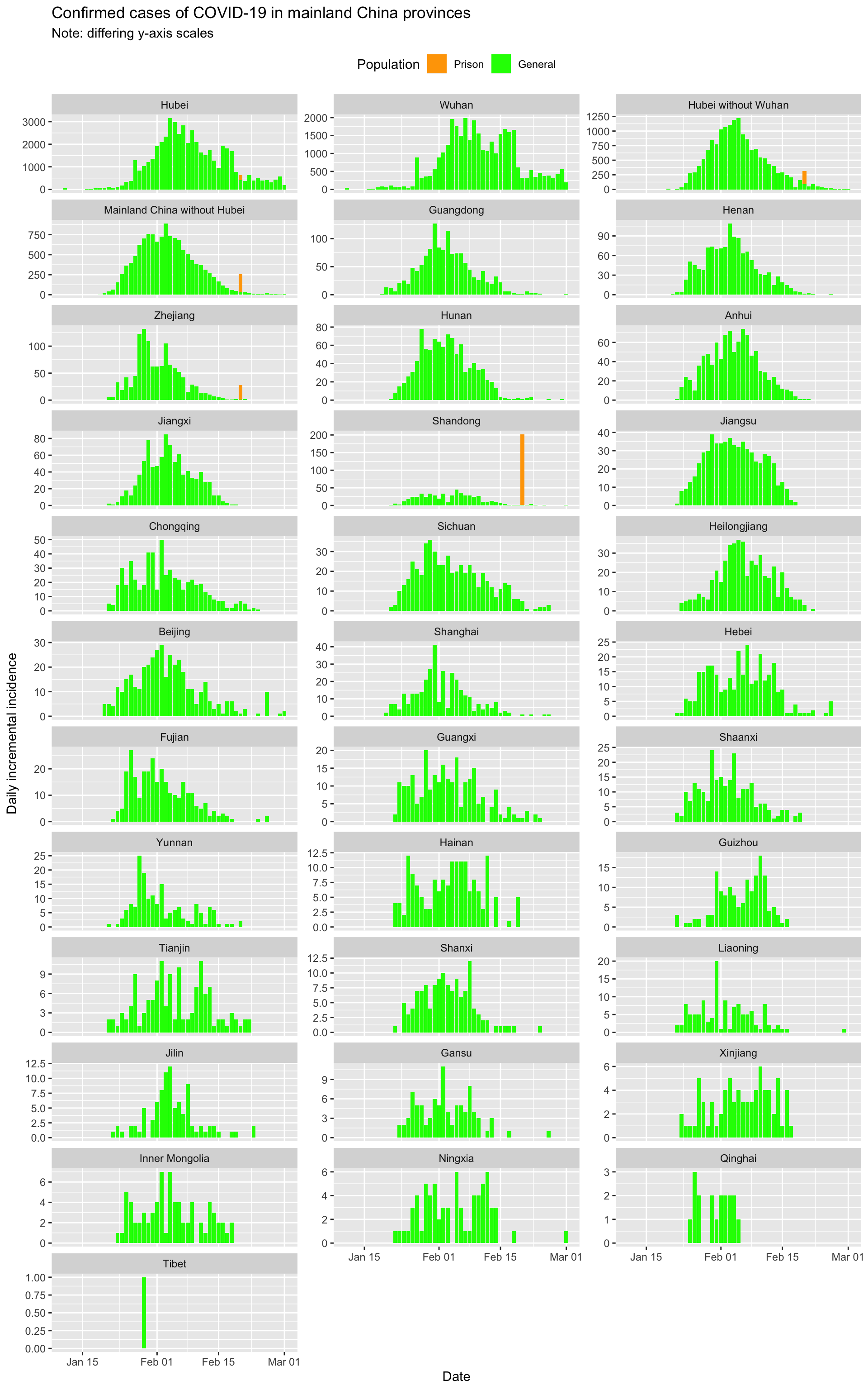
Clearly incidence is falling across mainland China, and in all provinces except Hubei will approach close to zero incident cases within the next week if trends continue.
Hubei, in particular Wuhan, has clearly suppressed the outbreak but may be struggling to completely extinguish it.
Or is it? Let’s fit some models to investigate further.
Modelling epidemic trajectory in Hubei province using log-linear models
A key question is how long it will take to extinguish the epidemic in Hubei province.1 In part 1 of this analysis, we made some predictions based on a log-linear model fitted to the first part of the decay phase in Hubei. How well did those predictions fair in the light of later observed incidence? Let’s see.
Here is the model fitted to just the first part of the decay curve for Hubei, which were all the data we had at the time of writing of the earlier post.

Now let’s project that model forward and compare it to subsequent, observed incidence data for Hubei.
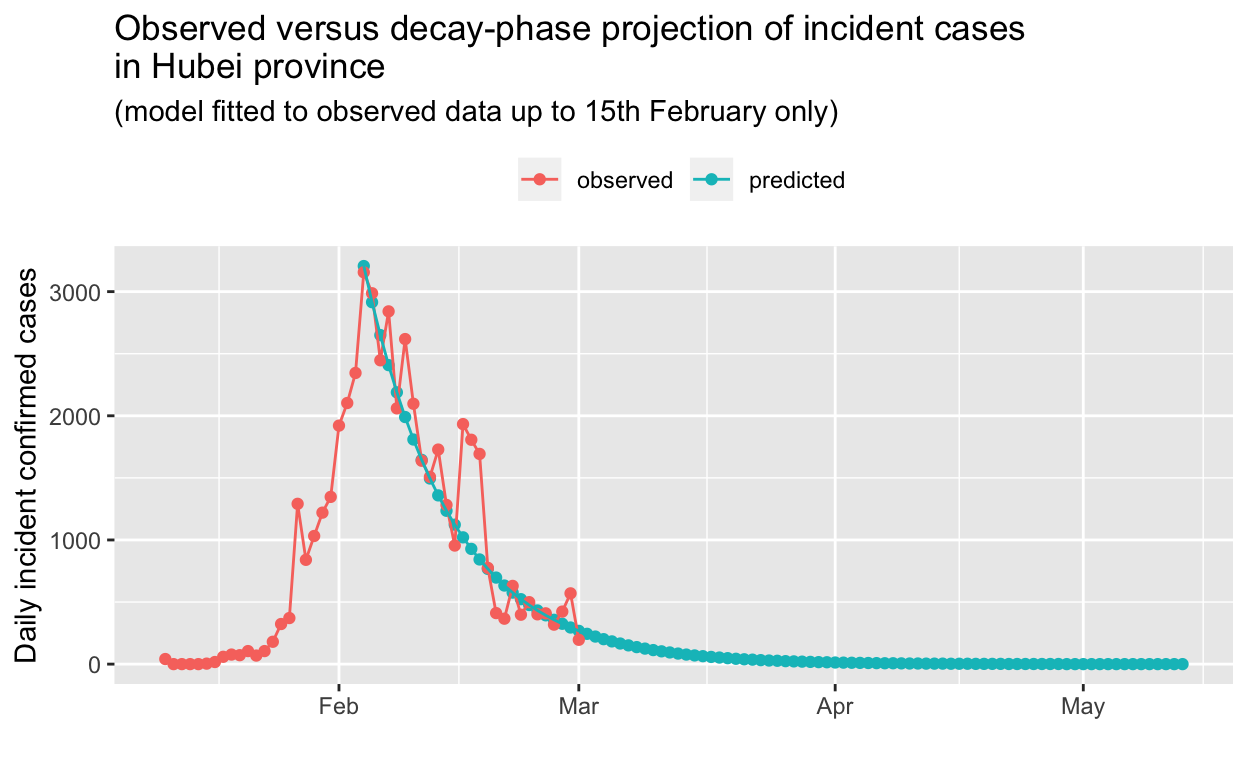
So, it looks like our log-linear model, fitted to the decay phase in Hubei using data only up to 15th February, accurately predicts the current situation as at 1st March.
Let’s re-fit the model using all the data up to the present (1st March).

The model for the growth phase looks good, but the decay model may be unduly influenced by the apparent excess of cases reported on 16th, 17th and 18th February. If we omit the data for those dates and re-fit the models, we obtain:
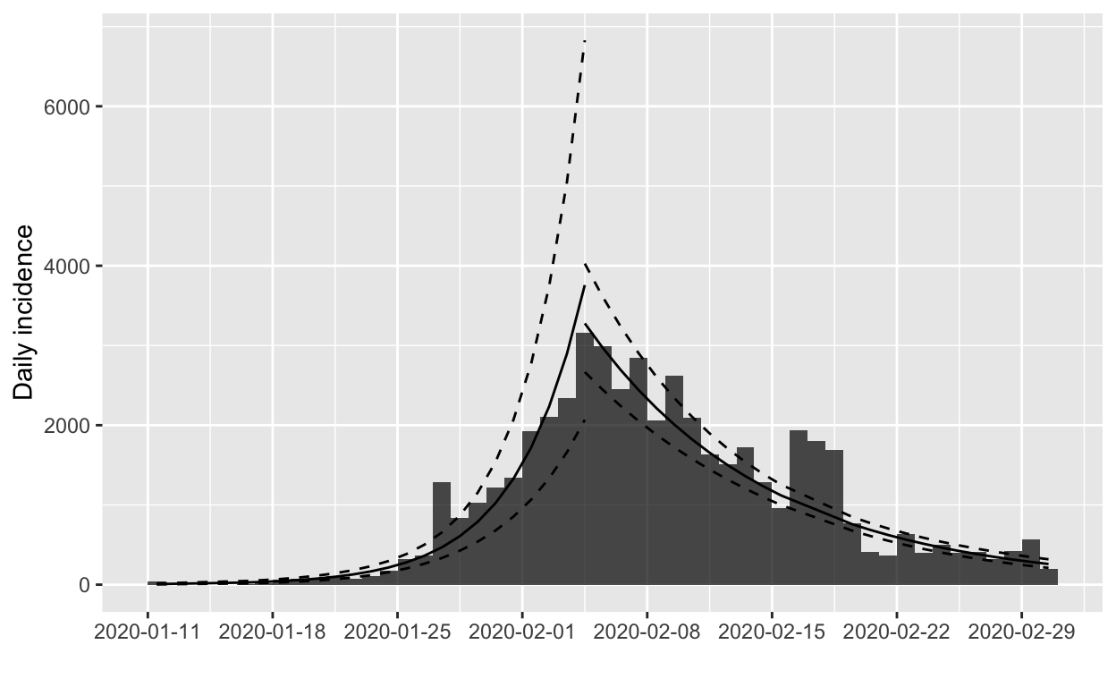
The fit to the decay phase looks much the same (illustrating the relative insensitivity of the model to apparent outliers), but we’ll verify by model fit statistics:
| Dates | R2 | Adj. R2 | Deviance |
|---|---|---|---|
| all | 0.85 | 0.85 | 2.71 |
| omitting 16-18 Feb | 0.91 | 0.91 | 1.50 |
On the basis of those statistics, we’ll prefer the model fitted to the data that omits the outliers. What does the projection look like now?
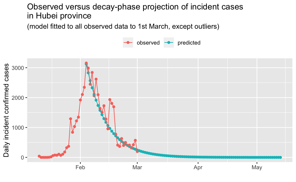
The scaling obscures detail, so we will focus on just the tail-end of the decay phase:
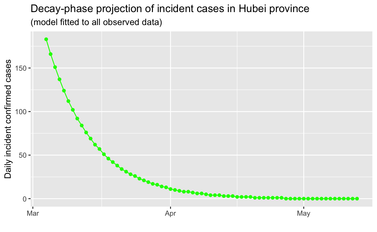
Based on this projection, it may take until mid-to-late April 2020 for the outbreak in Hubei to be extinguished, a lot longer than one might expect. The exponential behaviour of epidemics, in both their growth and decay phases, tends to be at odds with the human tendency to assume linear behaviour.
Japan
In this and subsequent sections of this post, we’ll use the methods provide by the RECON packages described above to assess the success or otherwise of public health efforts (or lack thereof) in containing or slowing spread of the COVID-19 virus.2
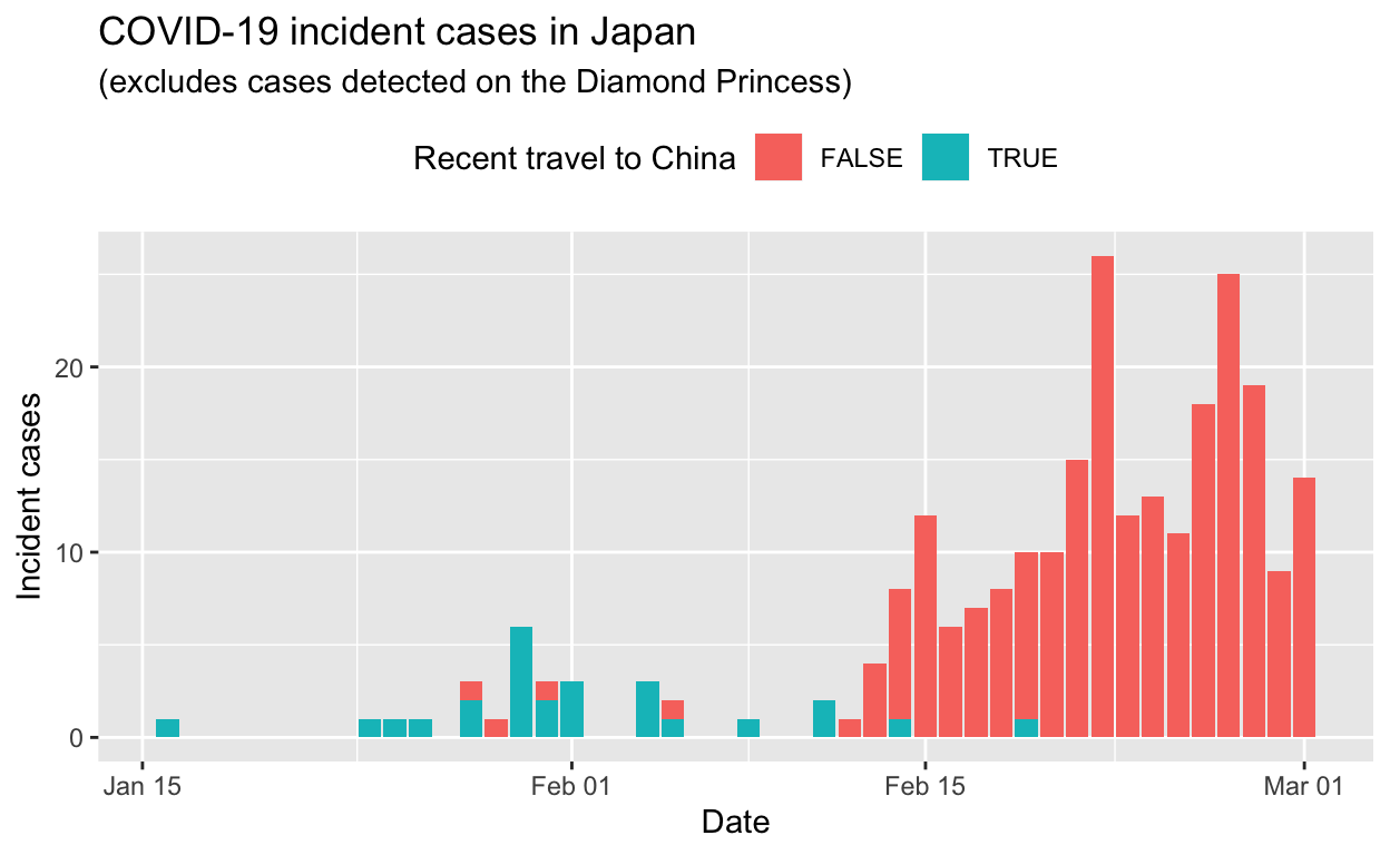
All non-cruise ships cases
We’ll exclude the all the cases which occurred and were detected on the Diamond Princess cruise ship from these data, for the sake of simplicity. Cases detected in former Diamond Princess passengers and staff after they disembarked the vessel are included, if my reading of the translations of the source web pages is correct.
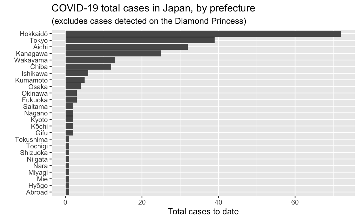
Let’s see the total cases by prefecture.
And the epidemic curves (daily incident case counts) for the top six prefectures.
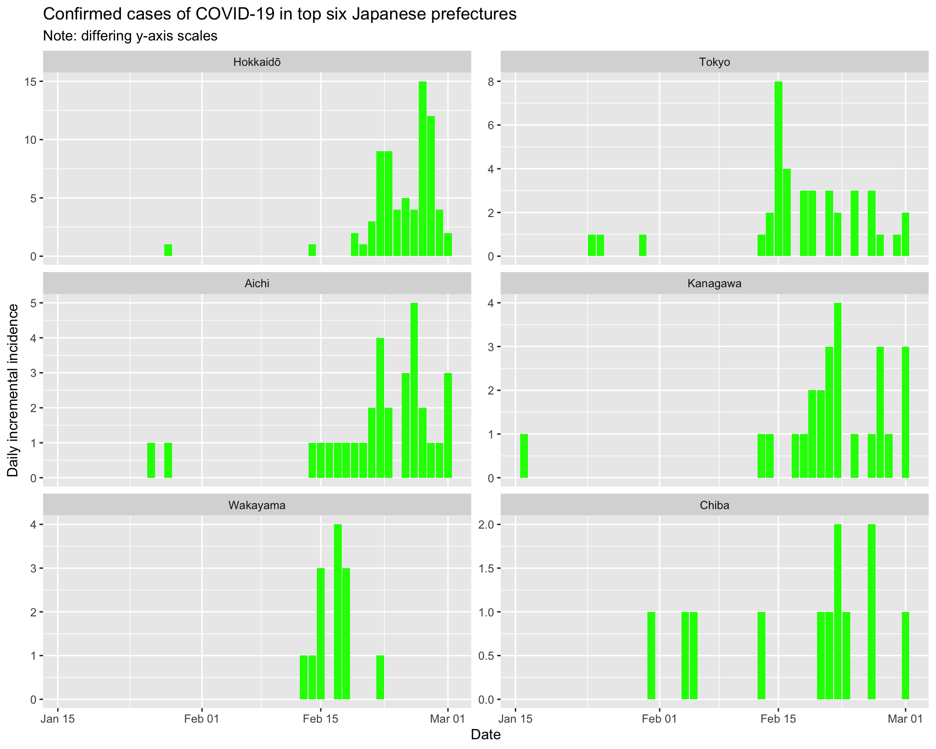
By prefecture
Now let’s examine the epidemic curves by prefecture, as well as 7-day sliding window effective reproduction number plots, and force-of-infection \(\lambda\) plots. Using these we should be able to make an assessment of how well containment efforts are succeeding (assuming that case detection and reporting doesn’t change).
Hokkaidō
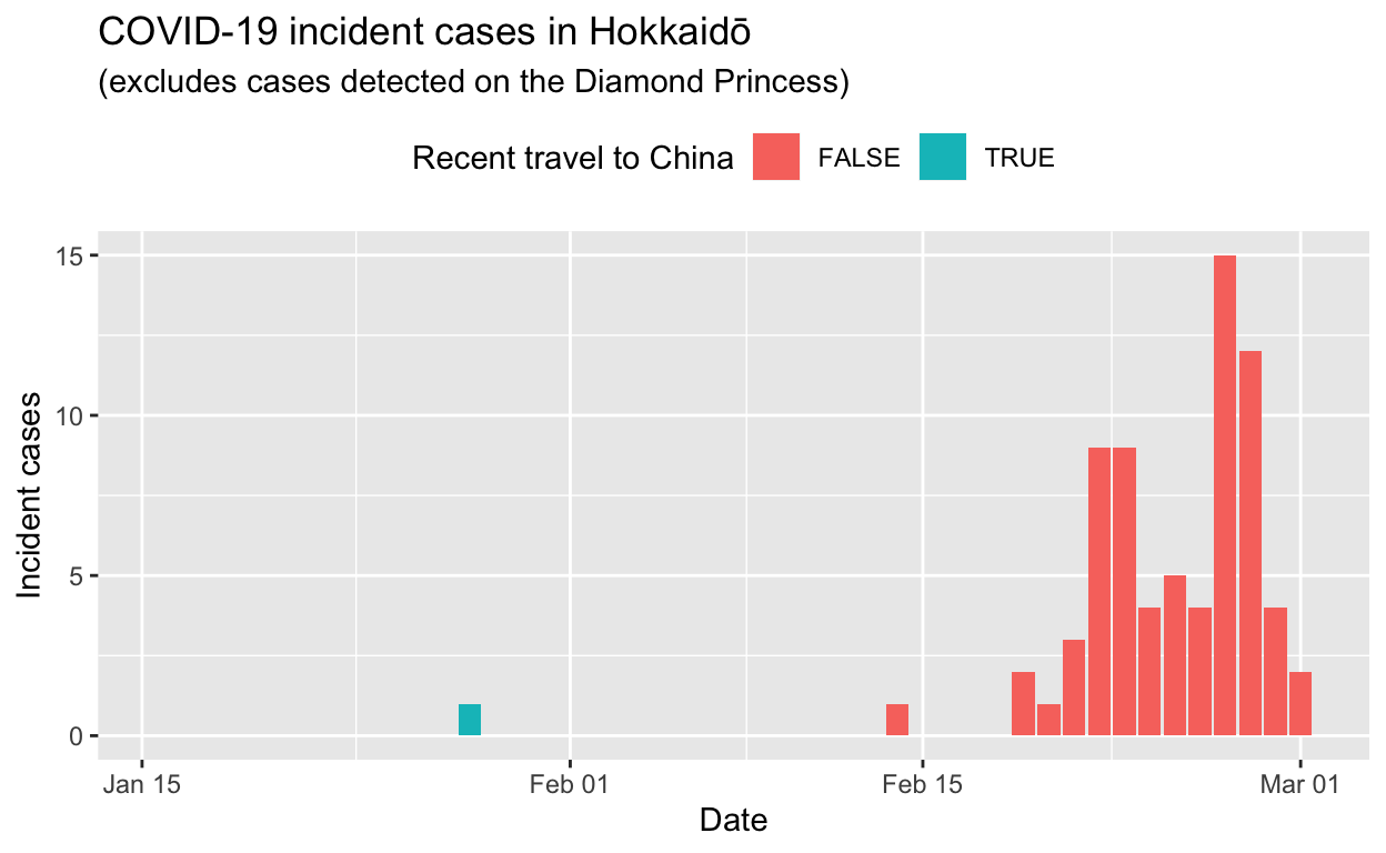
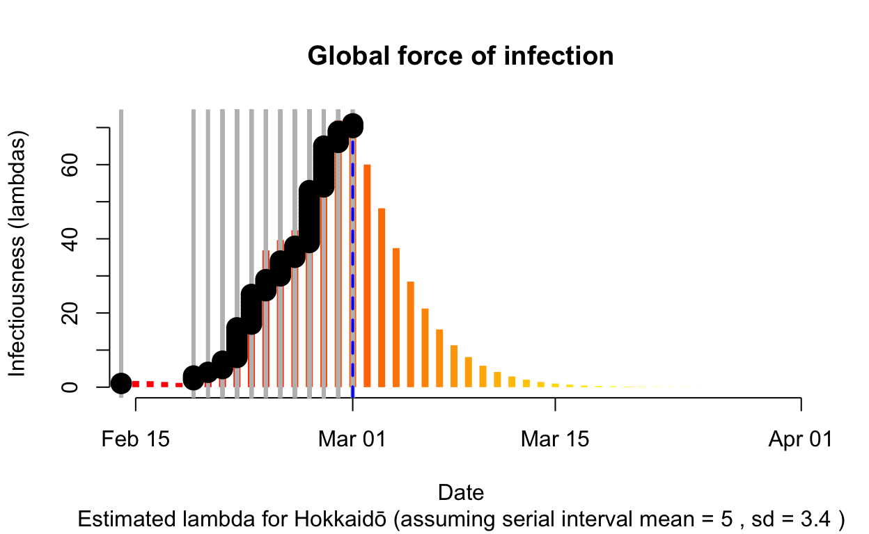

Assessment: Bringing the outbreak under control, but battle not yet won.
Tokyo
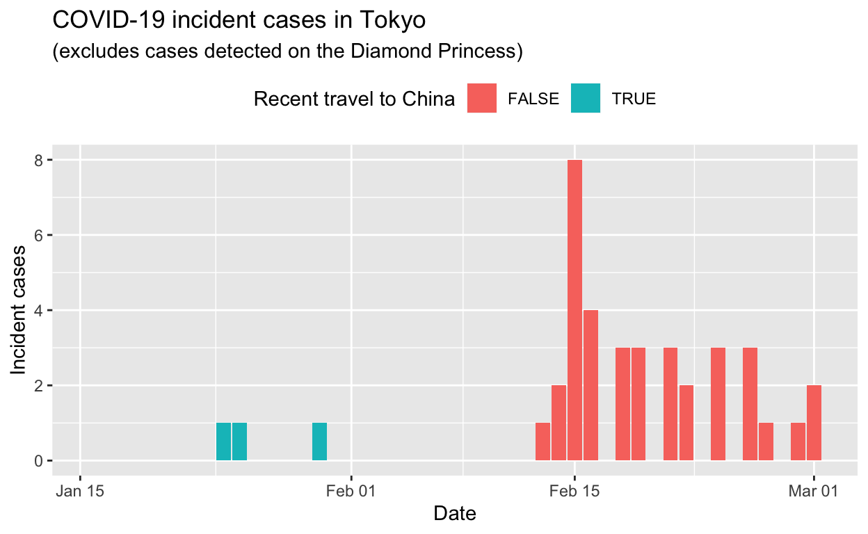
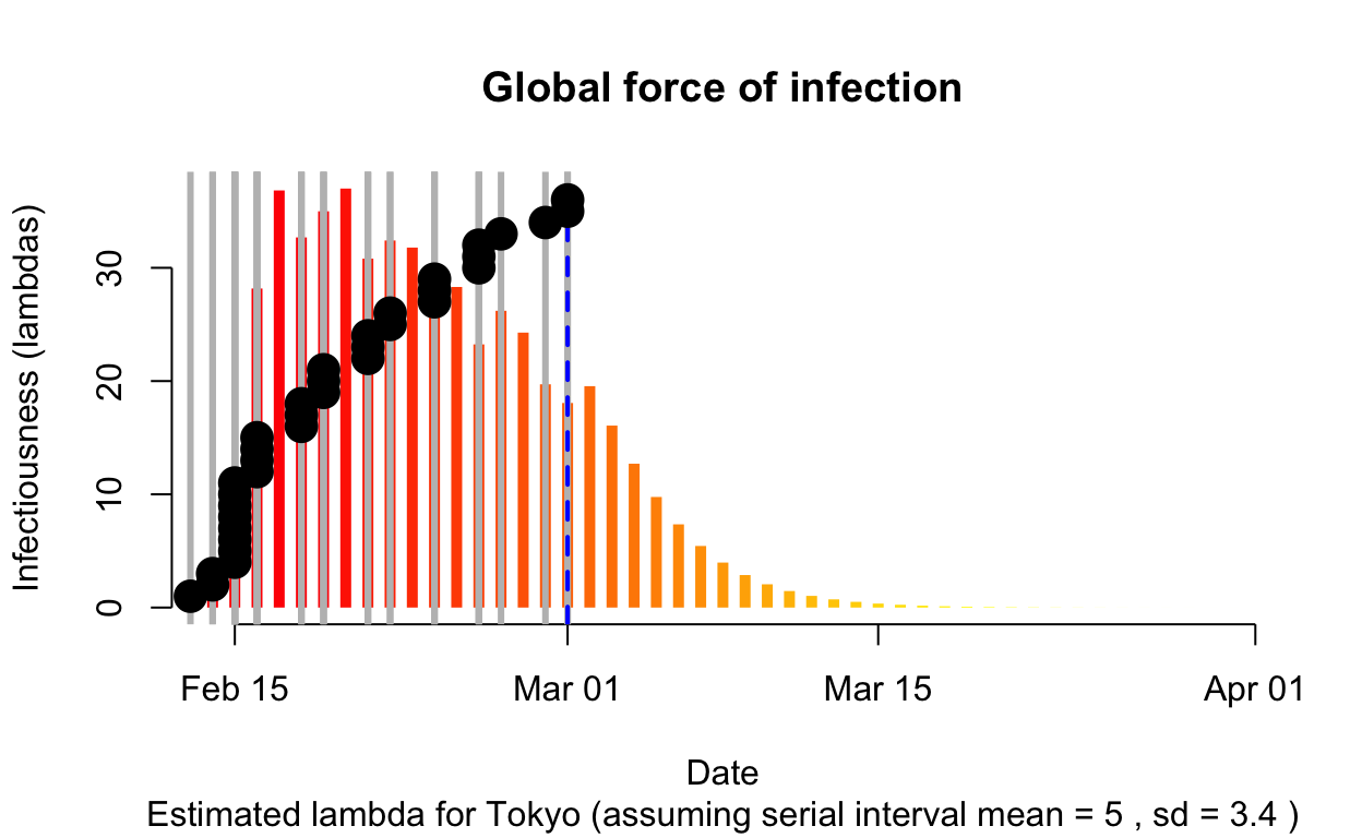
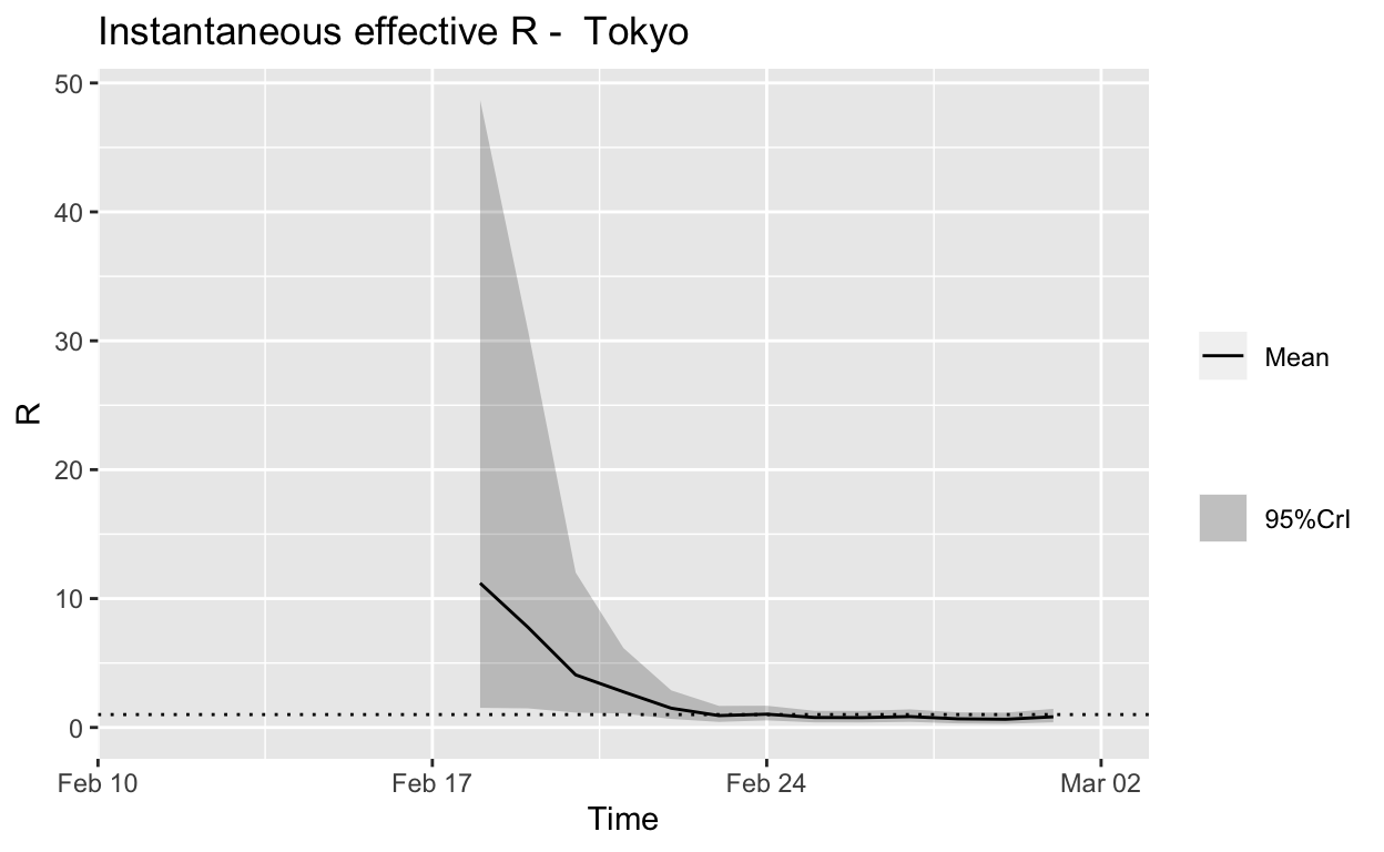
Assessment: The outbreak appears to be under control, and incident cases should continue to decline, ceteris paribus.
Aichi
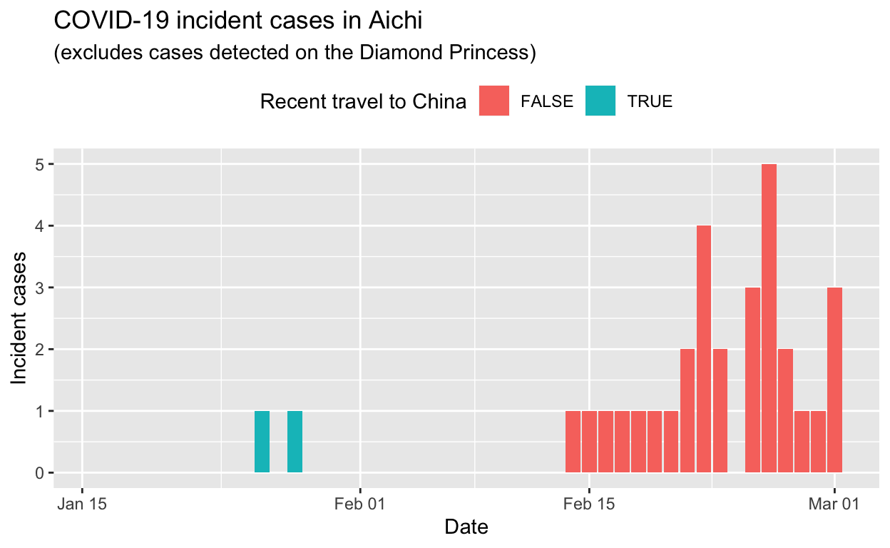
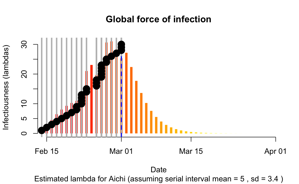
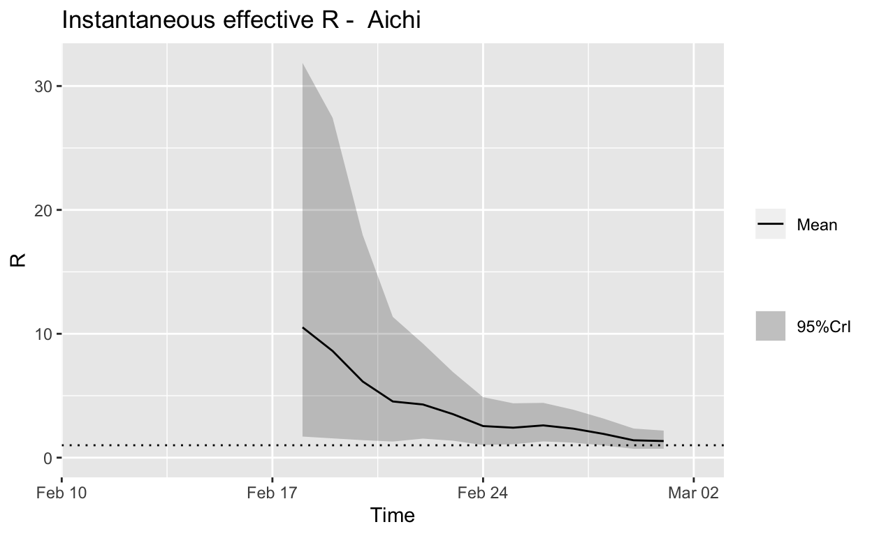
Assessment: Bringing the outbreak under control, but battle not yet won.
Kanagawa
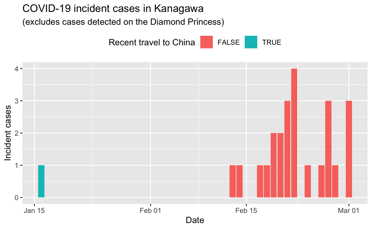
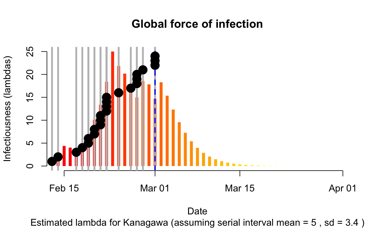
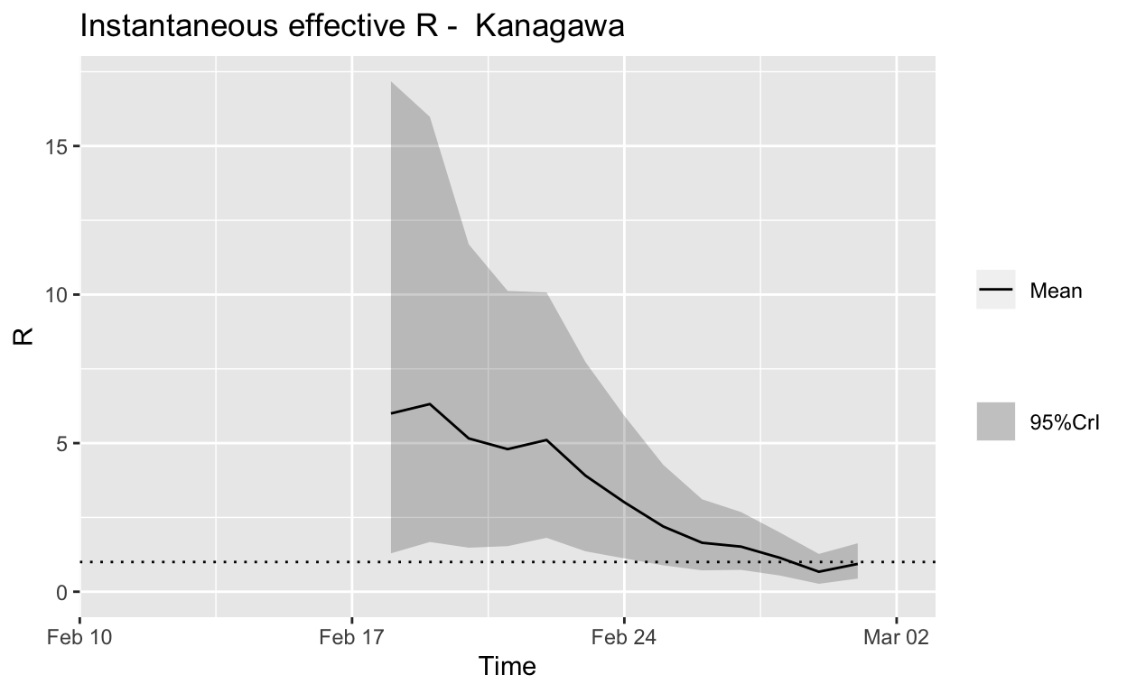
Assessment: The outbreak appears to be under control, and incident cases should continue to decline, ceteris paribus.
Summary
Overall, it appears that Japan still has a way to go before the current local outbreaks of COVID-19 are brought under control, but it does seem to be winning. Of course, new clusters seeded by international and internal travel are highly likely to arise – it will be an ongoing battle.
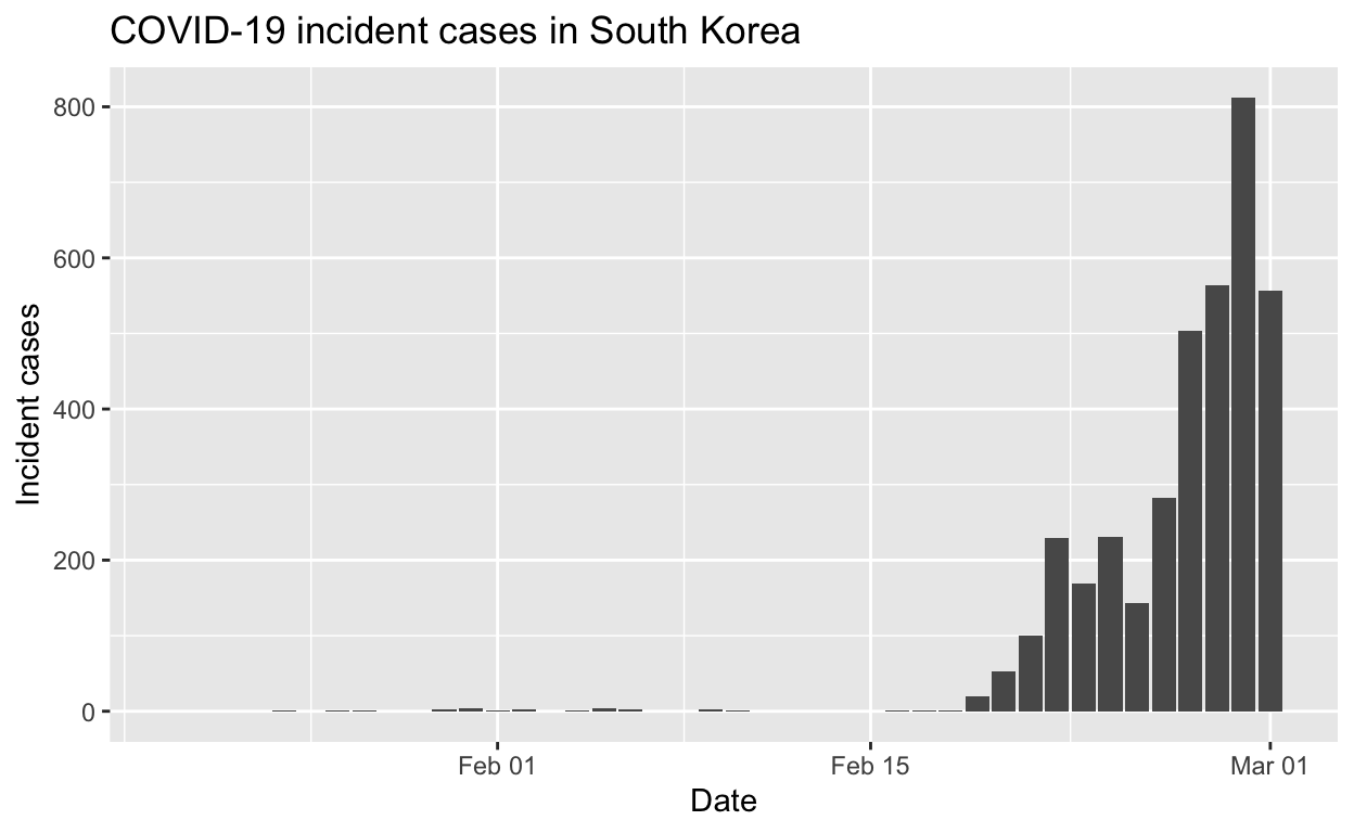
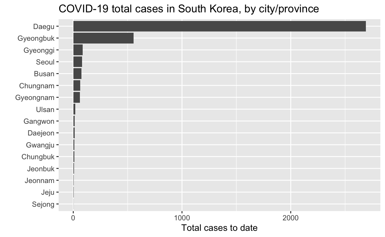
South Korea
We’ll repeat the analyses above for South Korea.
Let’s see the total cases by city/province.
And the epidemic curves (daily incident case counts) for the top six cities/provinces.
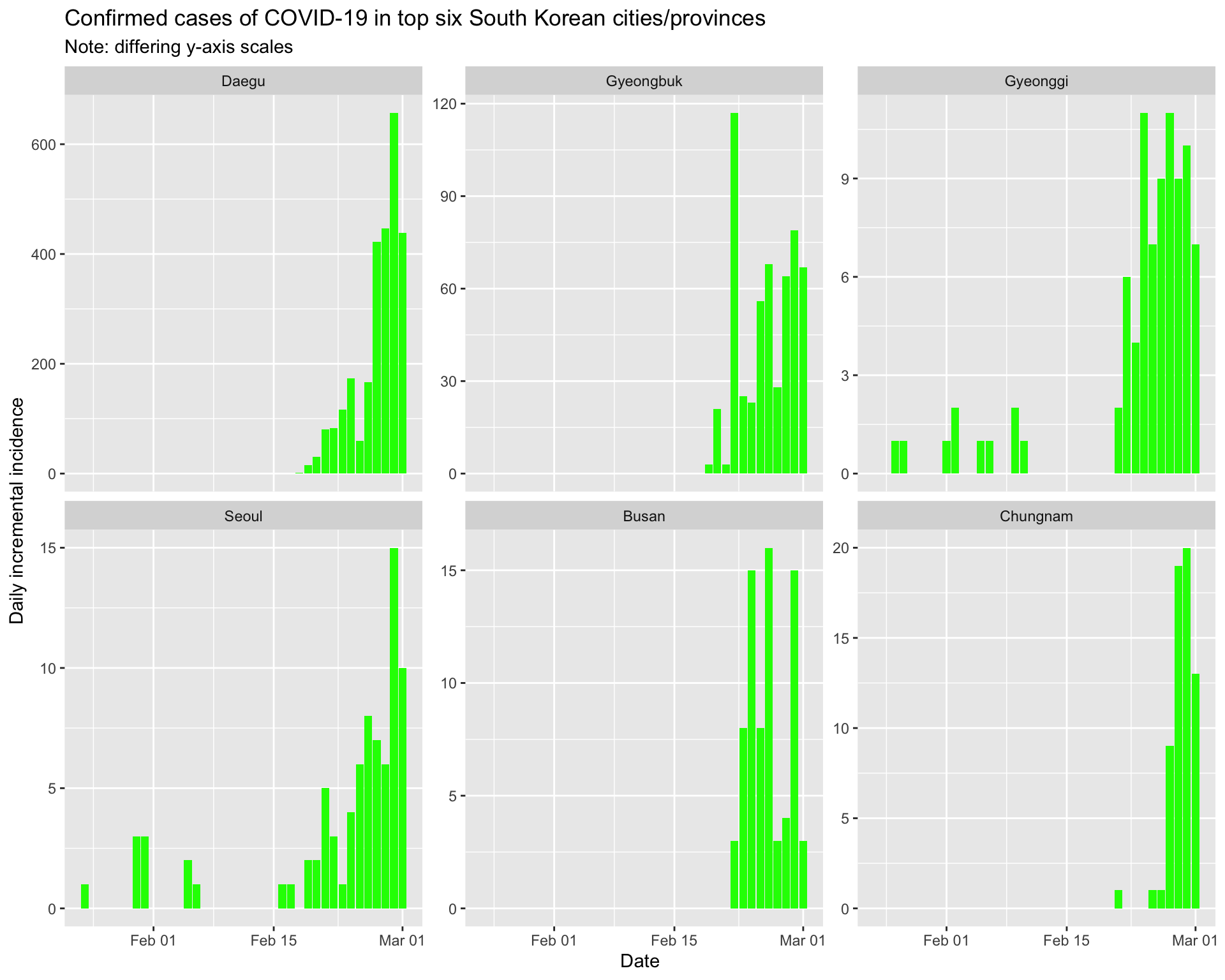
By city/province
Daegu
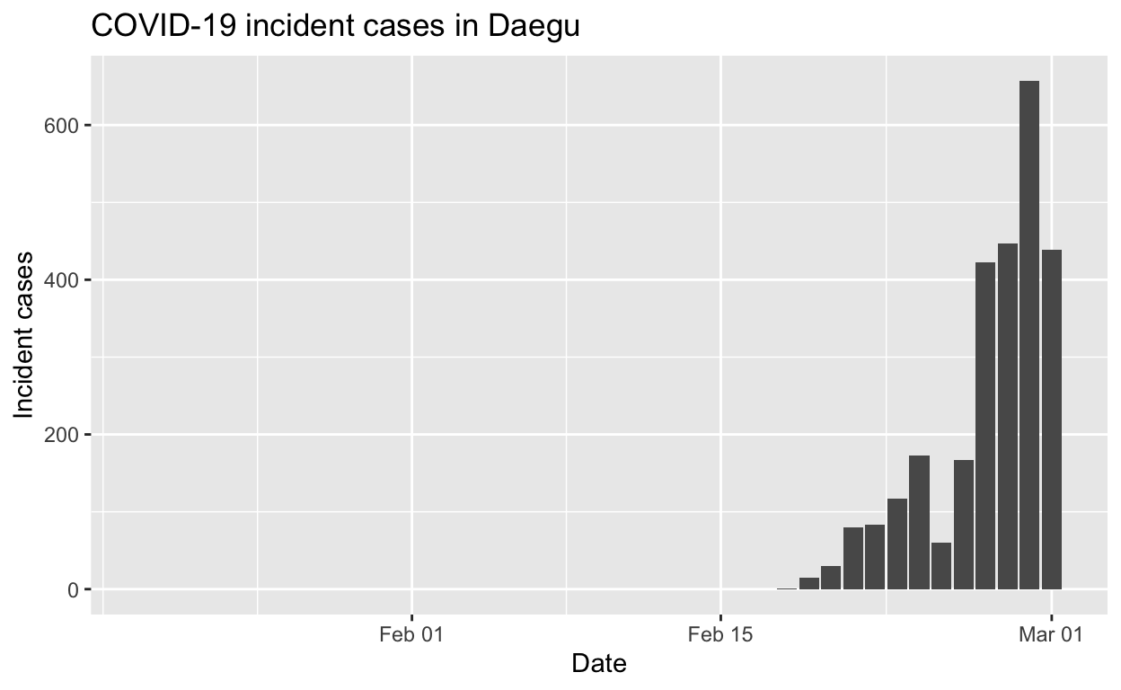
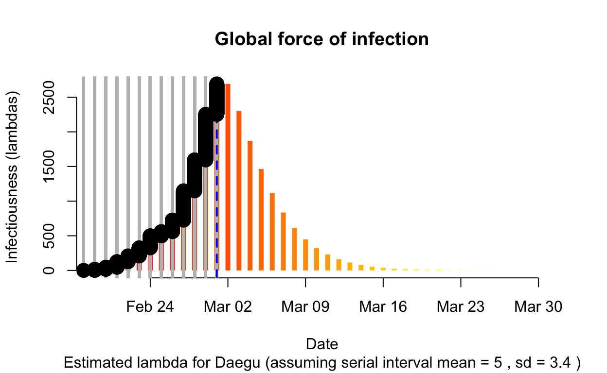
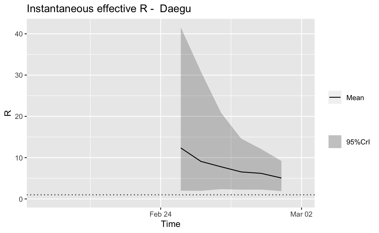
Assessment: The outbreak is not yet under control, but the \(R_{e}\) is at least falling.
Gyeongbuk
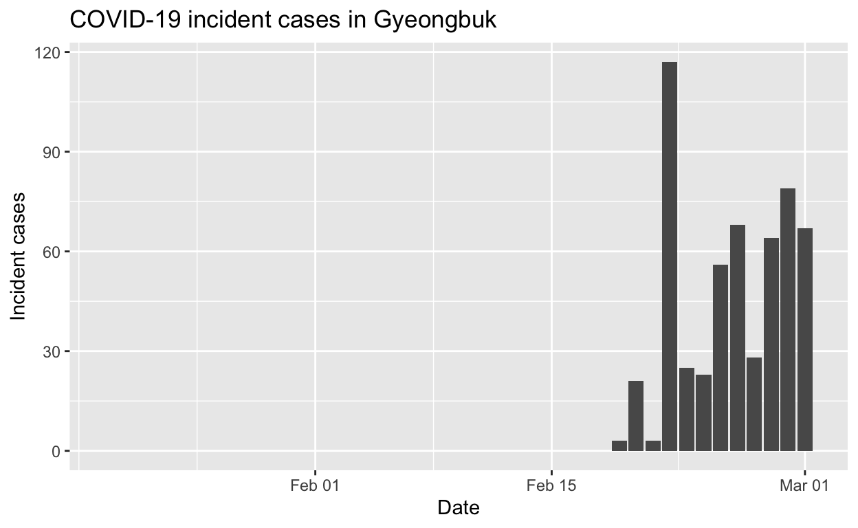
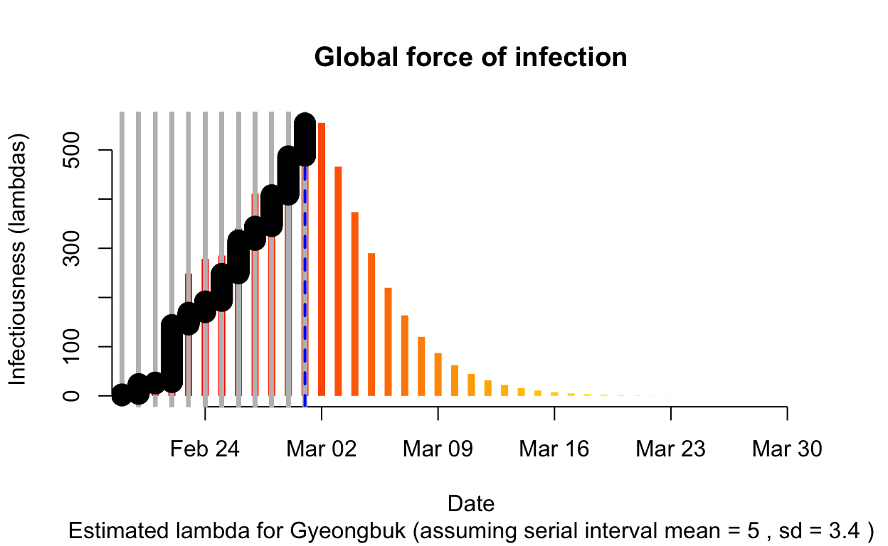
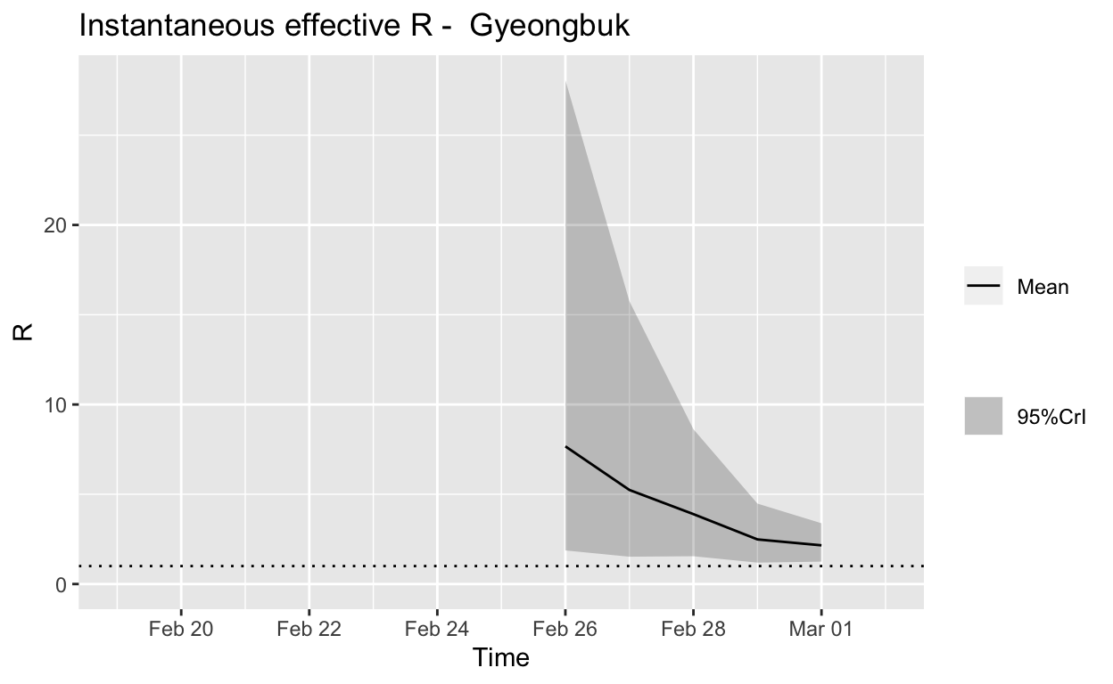
Assessment: The outbreak is not yet under control, but the \(R_{e}\) is at least falling.
Gyeonggi
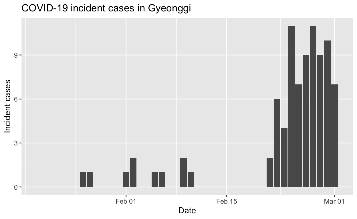
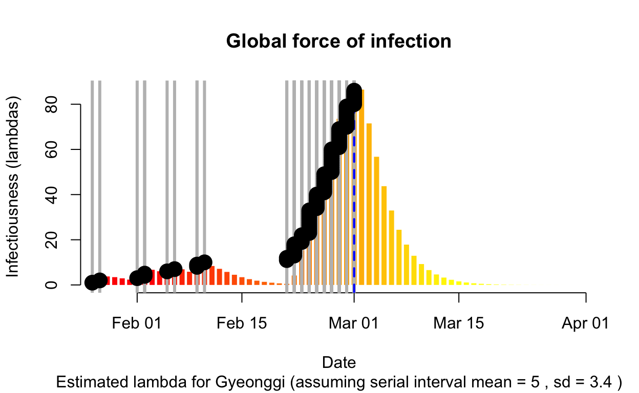
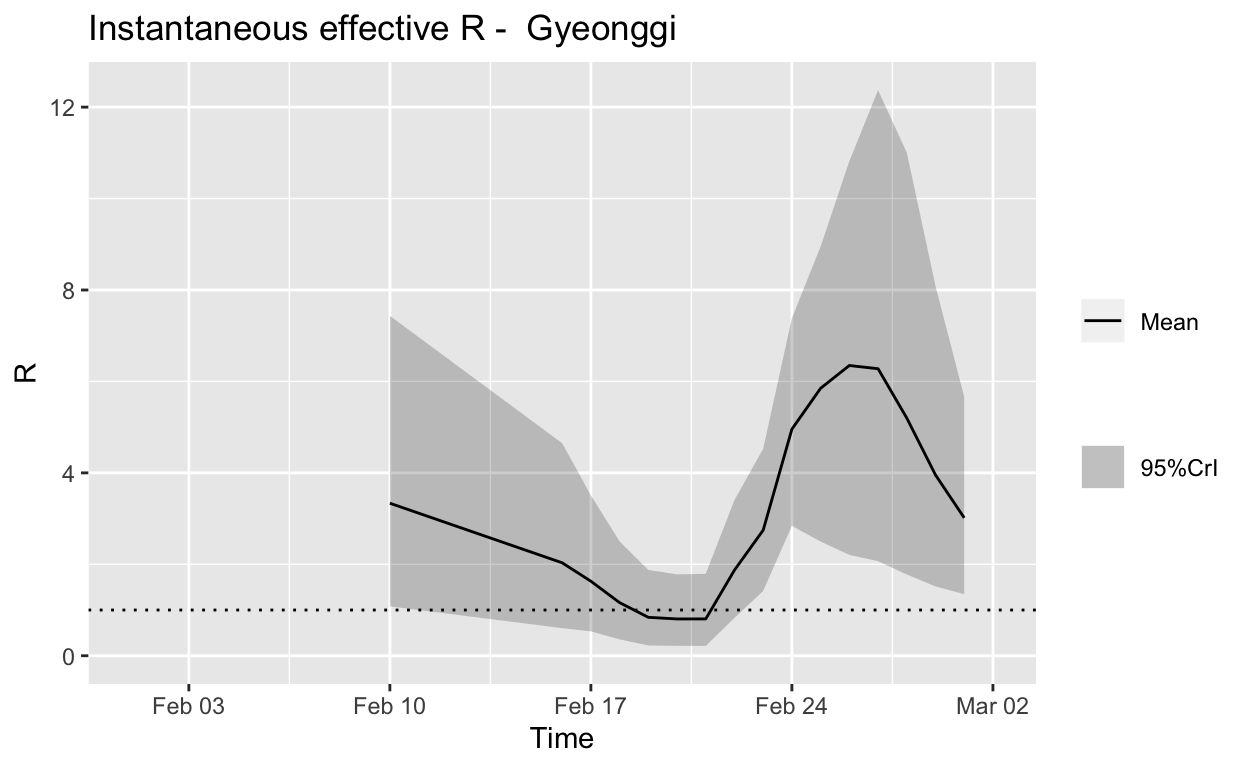
Assessment: Typical “second wave” pattern, but not really enough cases to make a reliable assessment, but the \(R_{e}\) does now appear to be falling.
Seoul
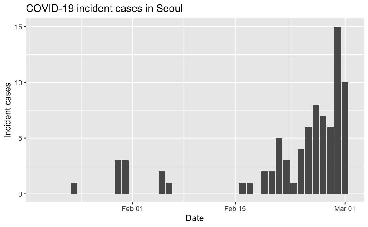

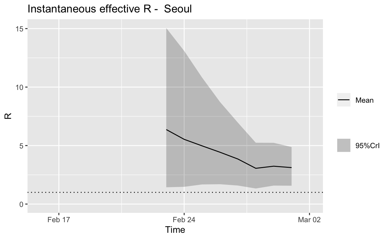
Assessment: The outbreak is not yet under control, but the \(R_{e}\) is at least falling.
Busan
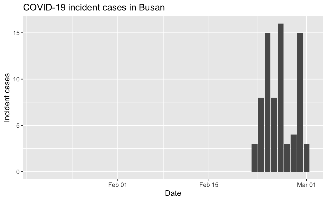
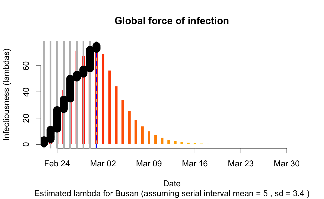
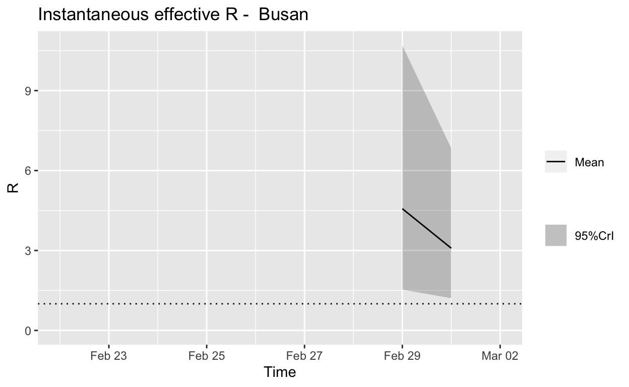
Assessment: Not really enough cases to make a reliable assessment, but best not to take a train to Busan.
Summary
There are promising signs that spread may be slowing, but it is clear that South Korean has a big fight on its hands to contain the Daegu outbreak and the other local outbreaks it has seeded.
Italy
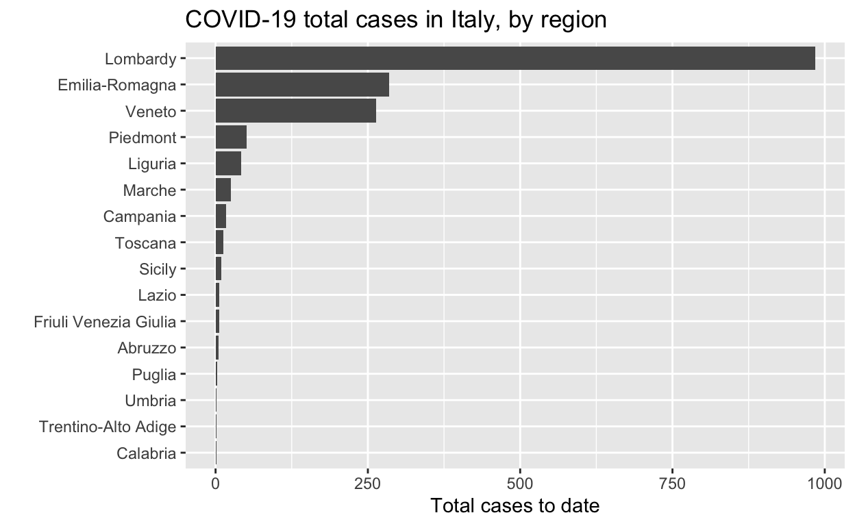
Let’s see the total cases by region.
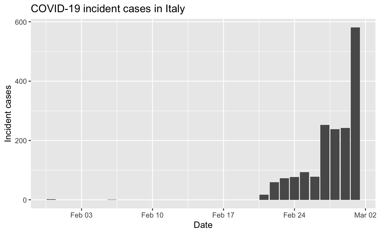
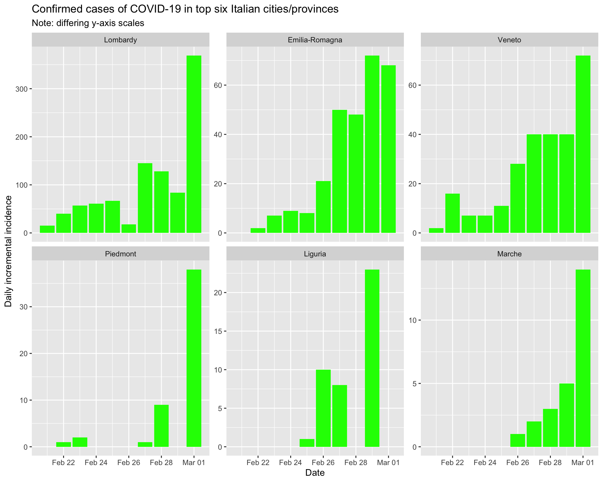
And the epidemic curves (daily incident case counts) for the top six regions.
By region
Lombardy
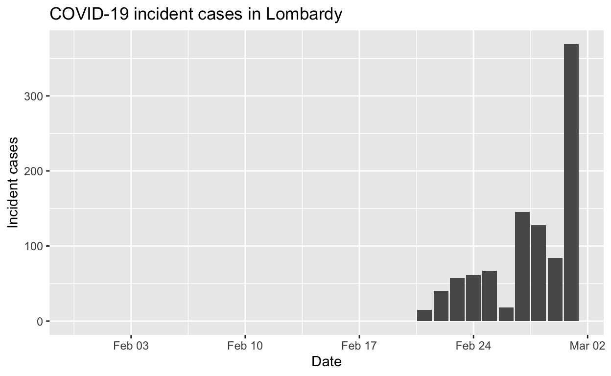

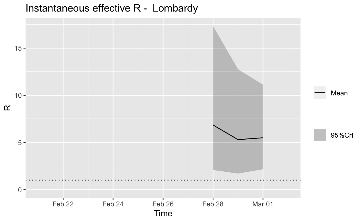
Assessment: The outbreak is not yet under control, too early to say whether \(R_{e}\) is consistently falling.
Veneto
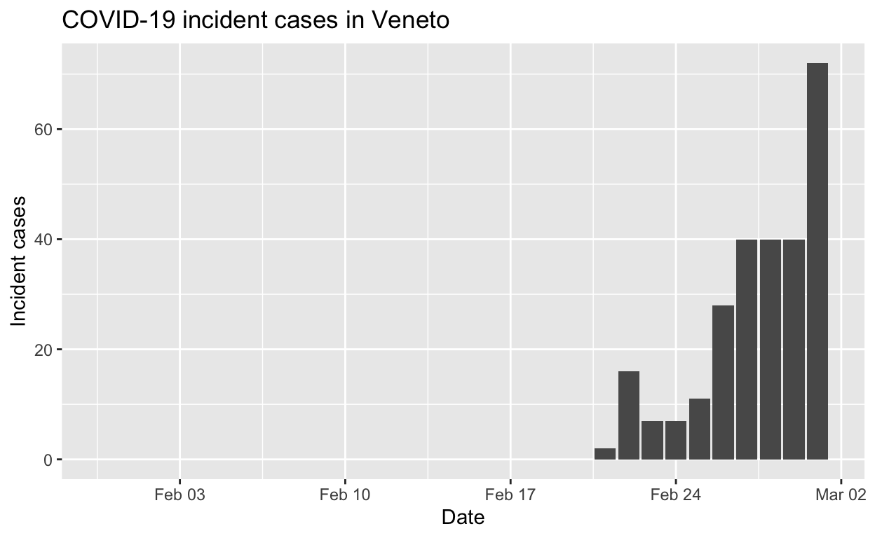
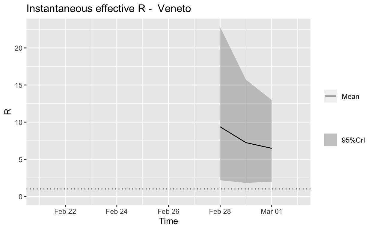
Assessment: The outbreak is not yet under control, signs that \(R_{e}\) is beginning to fall.
Emilia-Romagna
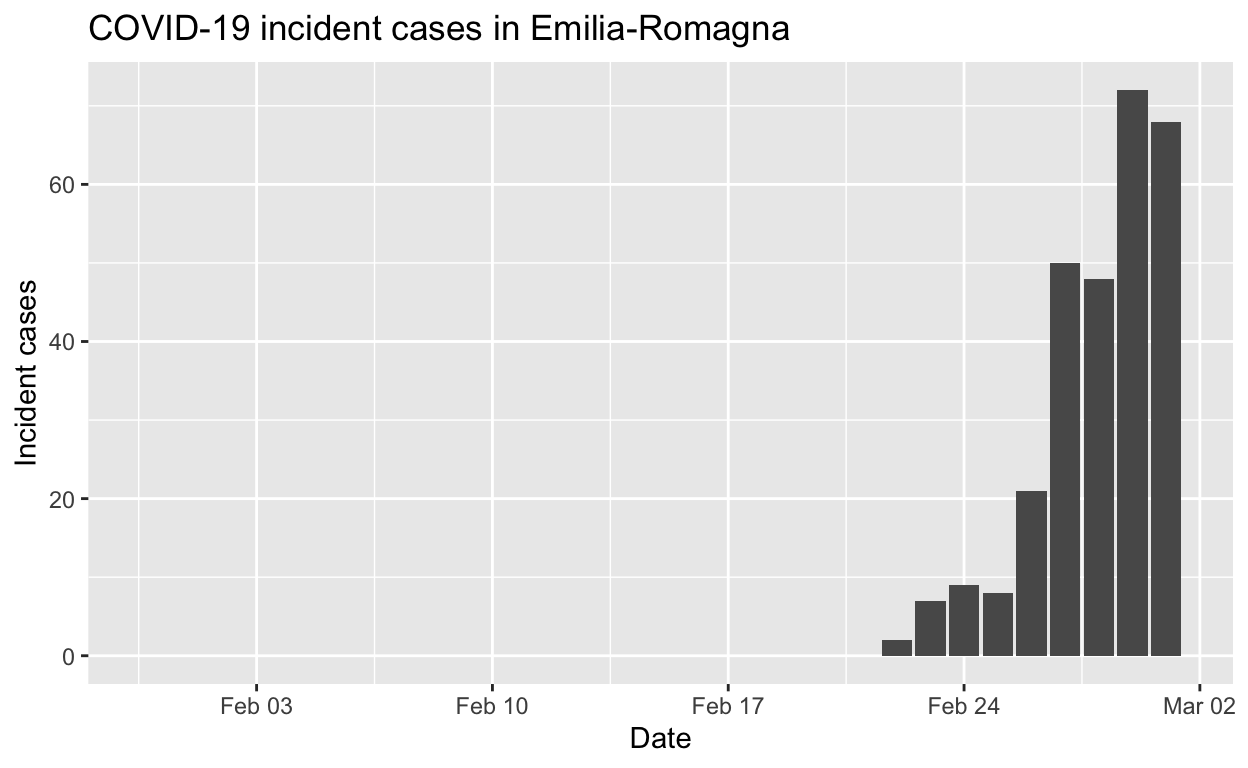
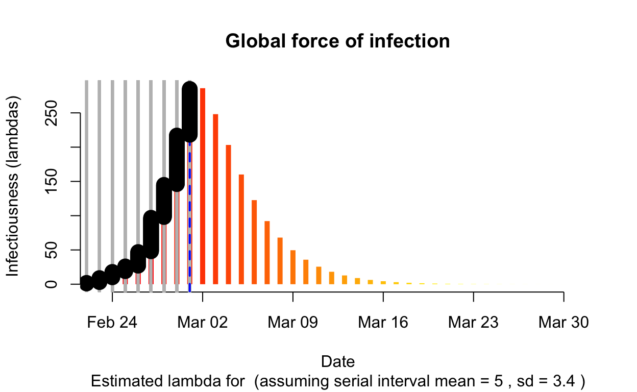
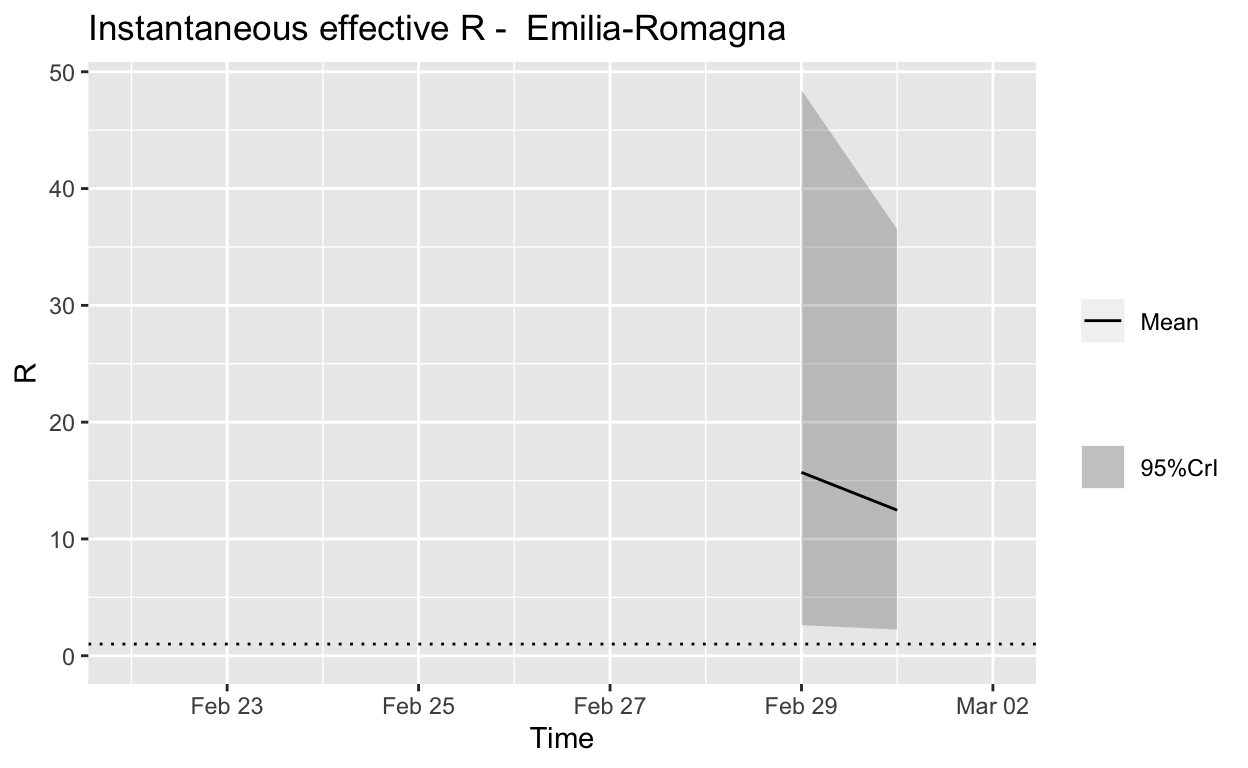
Assessment: The outbreak is not yet under control, too early to say whether \(R_{e}\) is consistently falling.
Piedmont
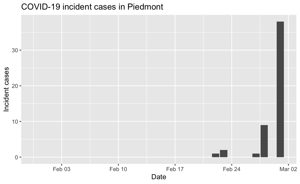
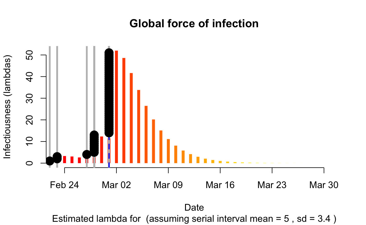
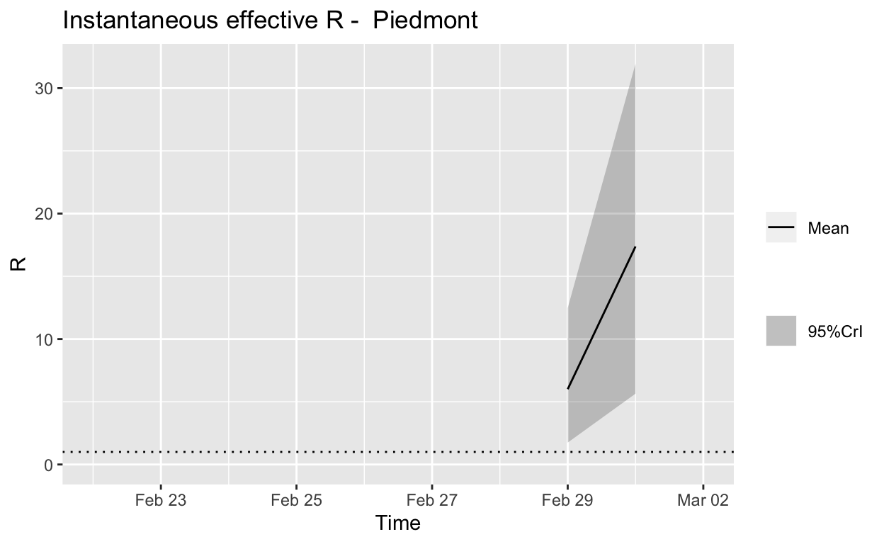
Assessment: The outbreak is definitely not under control.
Summary
Authorities in Lombardy took some bold and decisive steps to try to contain the outbreak there, and were then criticised for their actions being over-the-top. Such criticism was clearly not justified.
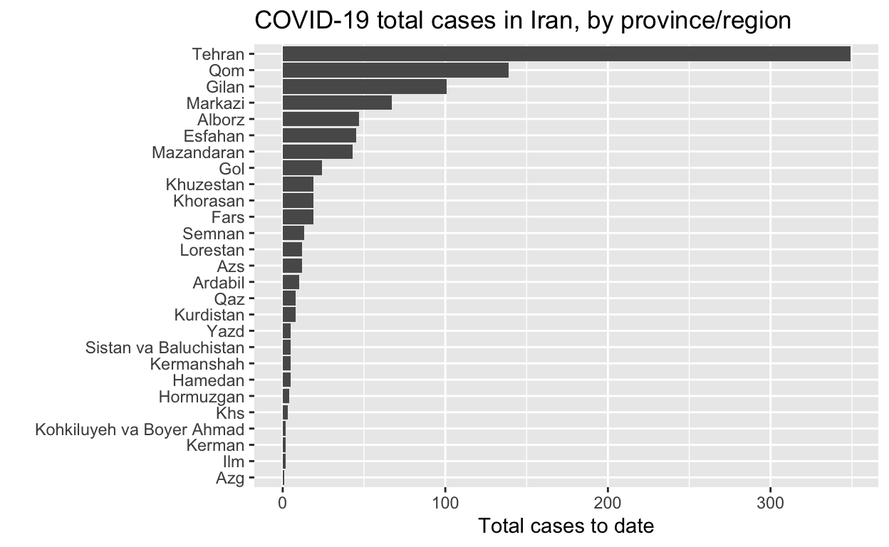
Iran
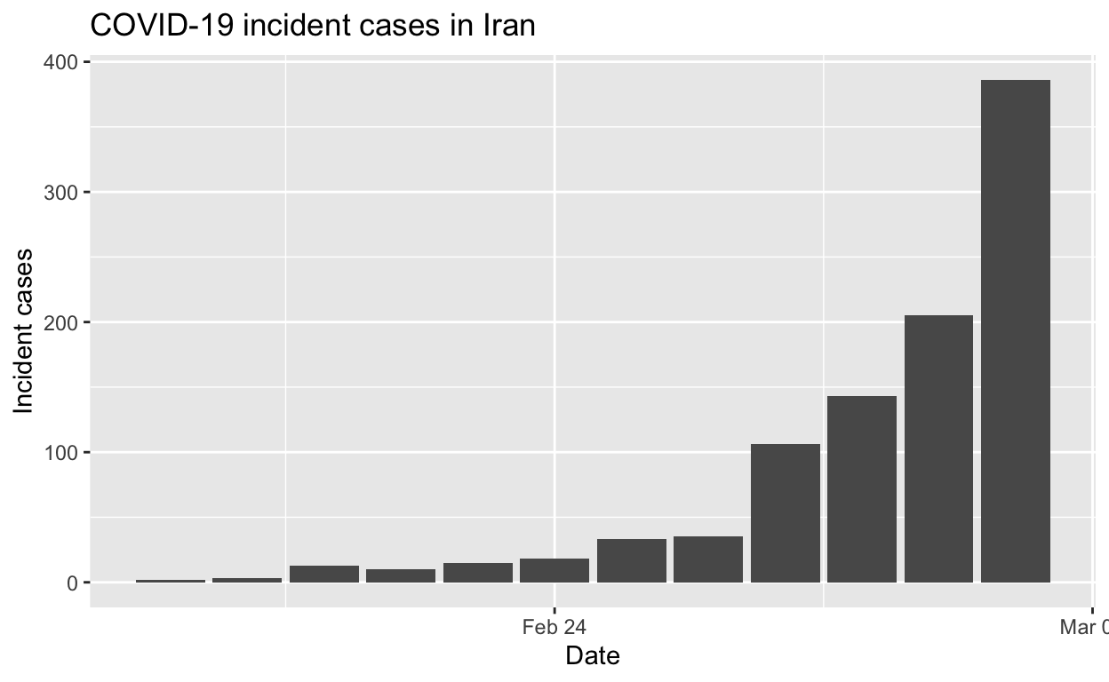
Let’s see the total cases by region.
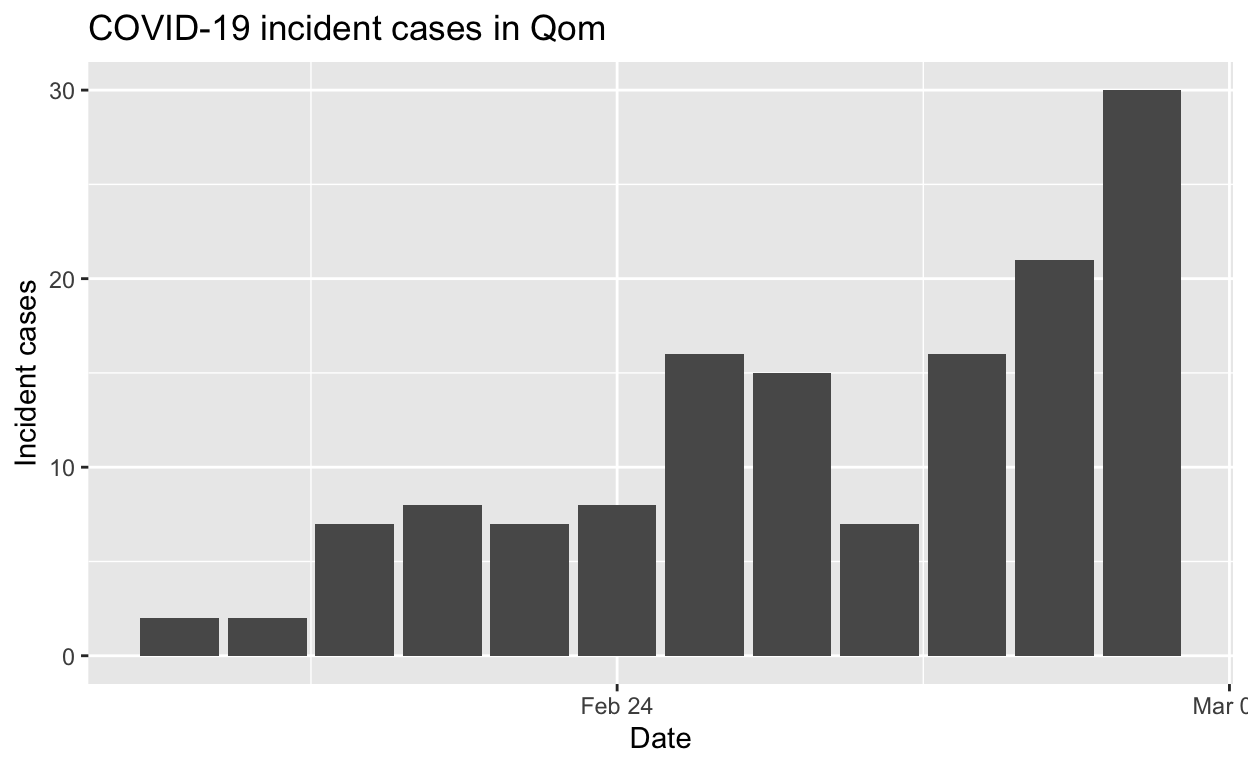
And the epidemic curves (daily incident case counts) for the top six provinces/regions.
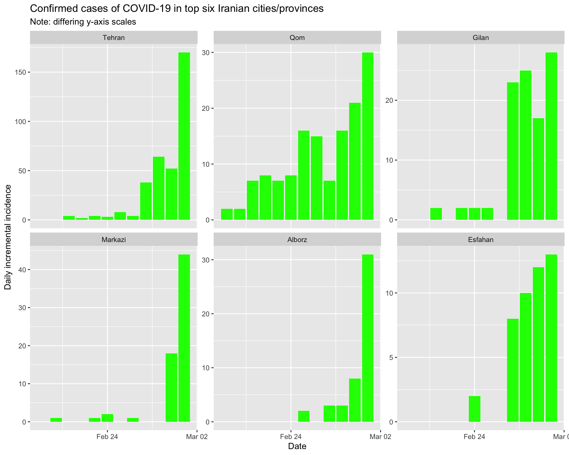
By city/province
Tehran
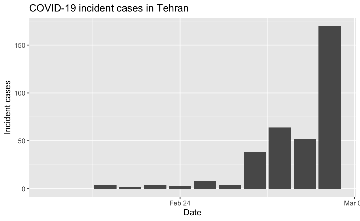
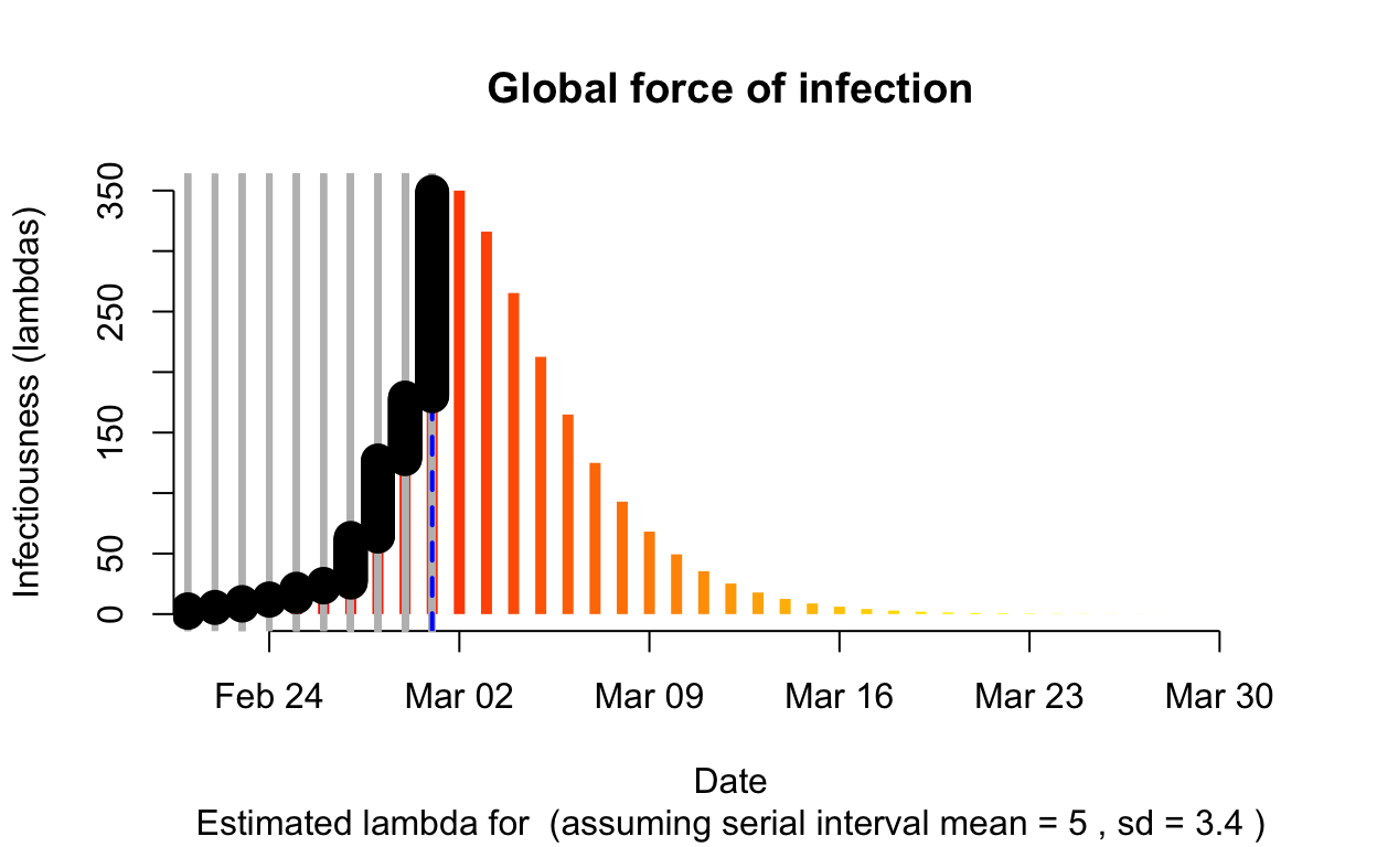
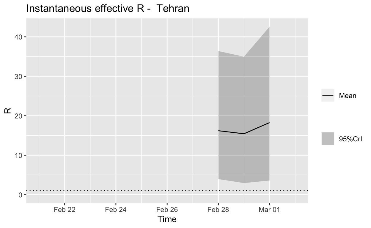
Assessment: The outbreak is not under control.
Qom
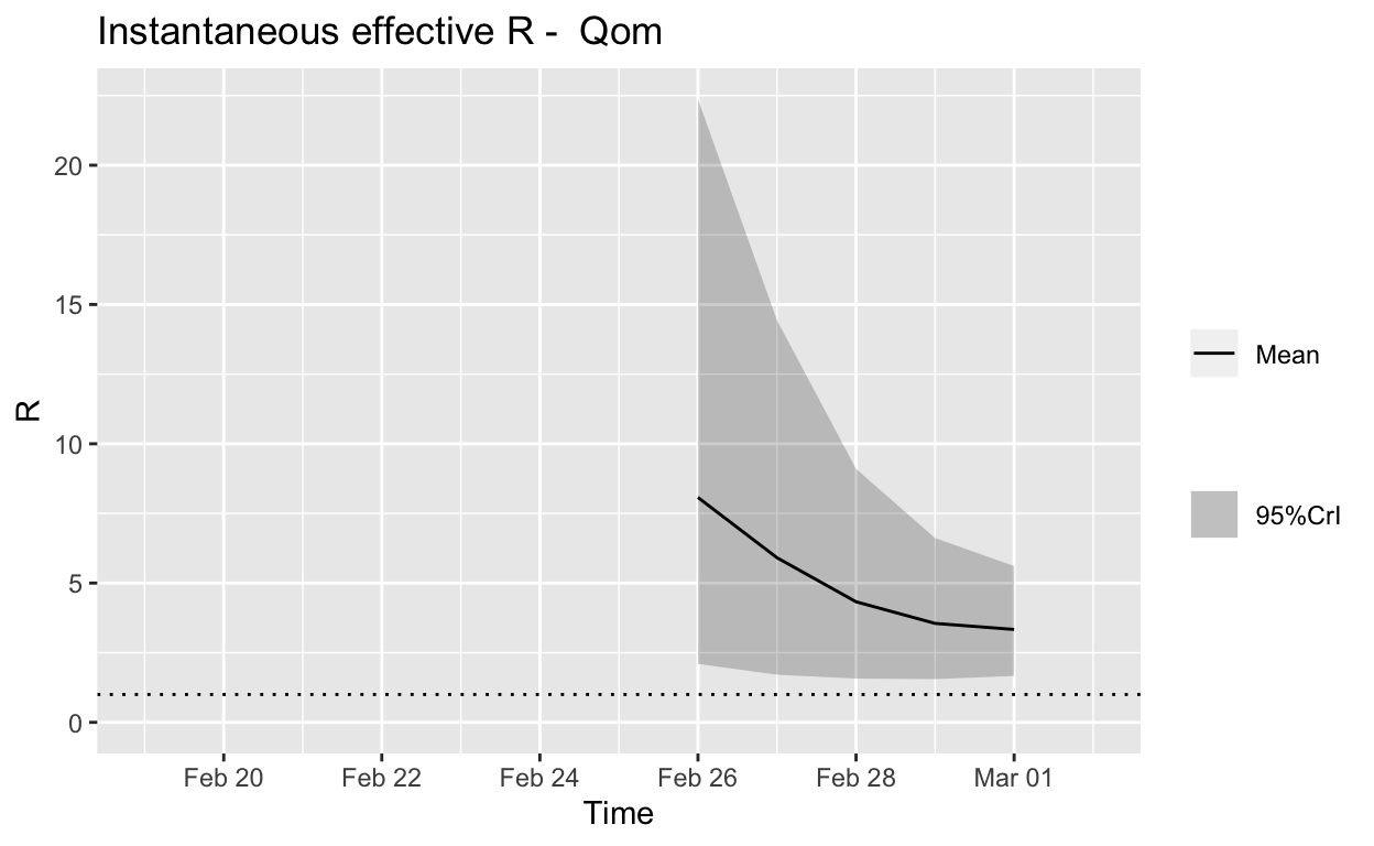
Assessment: The outbreak is not yet under control, but the \(R_{e}\) is at least falling.
Gilan
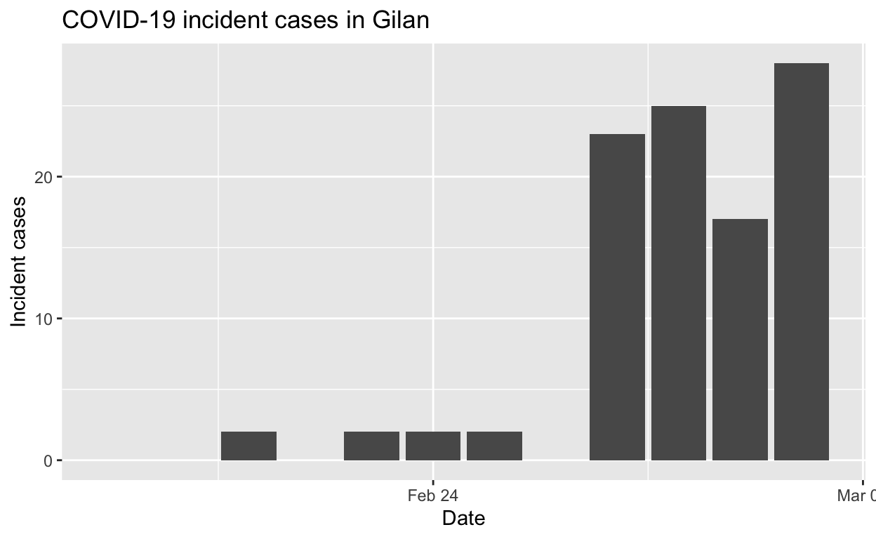
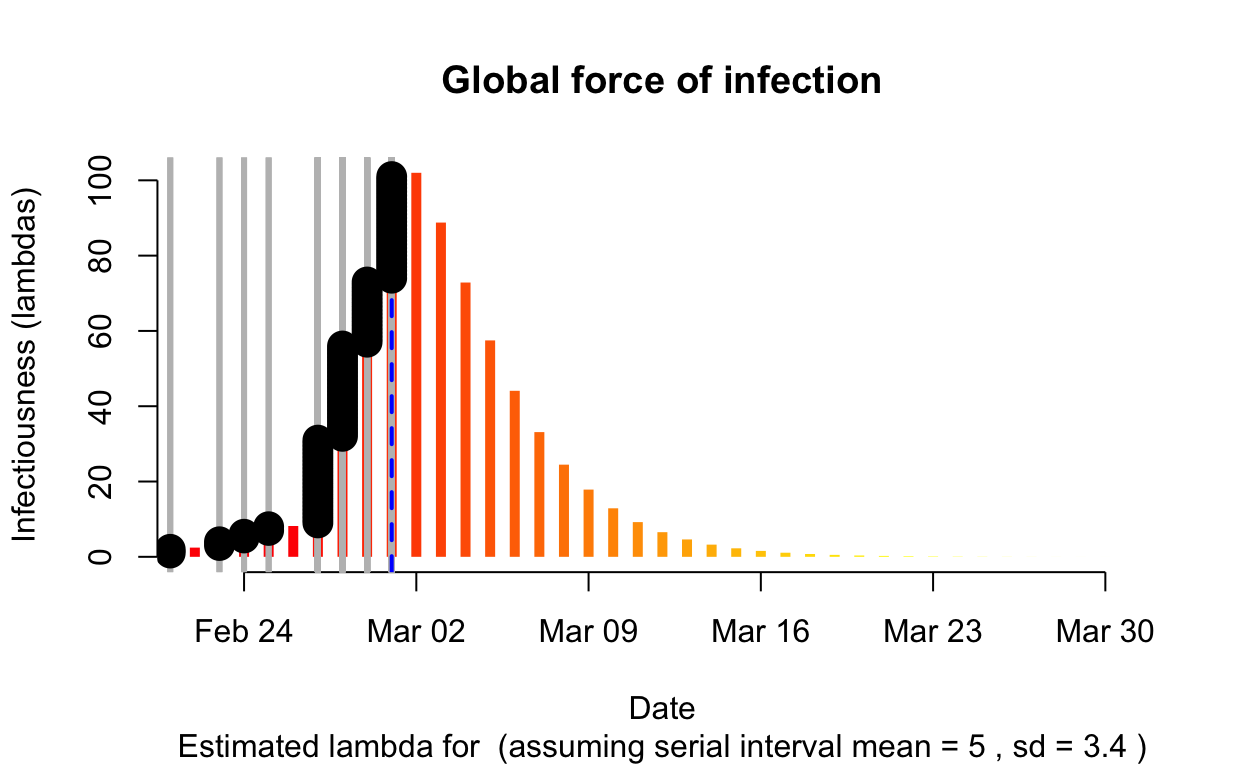
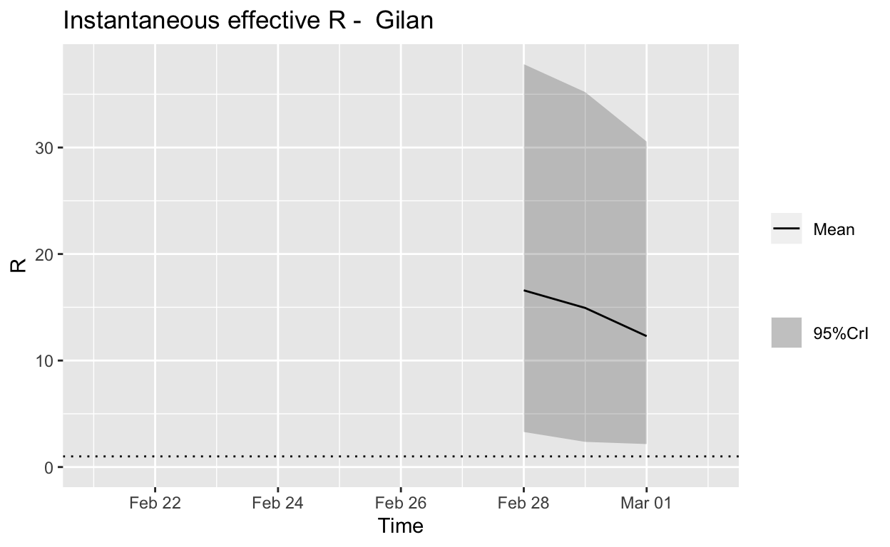
Assessment: The outbreak is not yet under control, but the \(R_{e}\) may be beginning to fall.
Summary
Under-ascertainment and/or under-reporting of cases is likely to be a problem in Iran. But even based on the reported incidence figure, local spread has not been contained sufficiently in most of the worst effected Iranian provinces. At the time of writing, we are now seeing asymptomatic or incubation-period travellers from Iran seeding cases around the world.
Conclusion
The simple visualisations and more sophisticated analyses in this post illustrate how the tools and capabilities of base R, the tidyverse and the excellent RECON packages can be used to assess the progress of the COVID-19 pandemic at national, regional or provincial levels, in a way that is more informative than the cumulative incidence plots which are now everywhere. Data scientists can and should start building such capabilities, right now, to assist international, national and local efforts to contain and slow the spread of the COVID-19 virus. Slowing the spread will save lives by reducing the load on health care facilities, which will be rapidly overwhelmed if transmission of the virus is allowed to proceed unchecked.
The same question will need to be answered in many other regions in many other countries before this is all over.↩
Yes, I know the official name for the virus is SARS-CoV-2, and that COVID-19 is the name for the disease it causes. But any mention of SARS-Cov-2 tends to confuse all but the most expert of audiences.↩